Choose Colours That Feel Right For You
There are people who choose colours with ease for their vehicles, accessories and clothing, but for some reason they have a great deal of anxiety when it comes to picking paint colours for their home.
Start by selecting colours you feel comfortable living with. Draw inspiration from nature, your favourite clothing, or decor you already own. If you’re hesitant about bold wall colours, add pops of colour through accessories—such as throw pillows or artwork—instead of repainting entire walls later.

Feeling Lost? Start by Eliminating What You Don’t Like
If you’re unsure where to begin, narrow your choices by ruling out colours you dislike. For example, if you don’t like yellows or greens, focus on blue, gray, or brown tones. This simple process helps you see which shades you will be most comfortable with in your home.
Current Paint Colour Trends
Major paint companies like Benjamin Moore and Sherwin Williams regularly share trend forecasts online and in stores. You can also find many decorating and home improvement websites that focus on colours. Use them for inspiration, but don’t get too caught up in short-lived fads. While gray walls dominated for years, some trends fade fast—choose colours you’ll love long-term.
Tips for choosing trendy colours wisely:
- Use trend palettes as starting inspiration — but always ask: will this colour look good for you in 5 years?
- Pair a trending hue with timeless neutrals or wood/stone elements to anchor the look.
- Test how the colour appears in your room’s lighting and context, not just from the palette photo.
- Decide whether you’re using the trend for an accent or entire wall — accent usage is less risky.
- Incorporate trend colours via decorative items if you’re hesitant to commit to wall-paint.
Use Paint Manufacturer Colour Tools
Benjamin Moore’s Colour Portfolio app lets you take a photo of any object and match it to their closest paint colour. You can also upload photos of your rooms to visualize new wall, trim, and ceiling colours.
Sherwin Williams’ ColourSnap Visualizer works similarly—you can test colours on your photos or explore their preloaded examples. Their website also offers helpful resources on colour theory and how to choose paint colours that work together.
Online Resources for Colour Inspiration
Houzz and Pinterest are excellent for collecting decorating and paint ideas.
- On Houzz, create an Idea Book to save your favourite colour schemes or projects.
- On Pinterest, search for specific ideas like “calm wall colours” or “popular blue bedroom colours,” then pin them to organized boards for future reference.
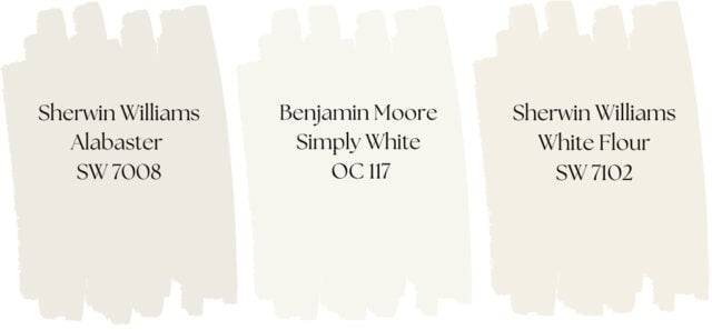
You can also browse interior design blogs or YouTube reviews for insights on popular colours (e.g., “Benjamin Moore Simply White review”).

Creating a Mood With Paint Colour
Paint colour has a powerful impact on mood and emotion—it sets the tone for how a room feels and functions.
Ask yourself what kind of atmosphere you want to create:
- Relaxation and tranquility in a bedroom
- Playfulness and fun in a child’s room
- Calm, spa-like tones in a bathroom
- Energy and creativity in a workspace or home gym
Do you want the space to feel light and airy, or warm and intimate?
For more insight and examples, see our post: How Room Colours Affect Mood
There’s Nothing Wrong With Choosing Neutral Colours

Neutrals aren’t boring—they’re timeless, versatile, and provide a perfect backdrop for furniture, artwork, and decorative accents to shine. Using neutral wall colours allows you to change your décor and accessories without repainting, making them a practical long-term choice.
Warm greige or beige walls create a cozy, comfortable atmosphere, while creamy whites bring a fresh feel to help rooms feel larger and more open.
For added interest, consider a monochromatic palette, using several shades of the same colour throughout a room or home for subtle depth and sophistication. Alternatively, many paint brands offer pre-selected complementary colour schemes, making it easier to coordinate walls, trim, ceilings, and accent features while ensuring your space feels harmonious and well-balanced.

Choosing Paint Colours for Renovations or Redecorating
When renovating or buying new furniture, choose paint last. Start with fixed elements like flooring, countertops, and cabinets, then your main furnishings. Once those are set, select paint colours that tie everything together. Paint offers endless colour options—you can always find a shade that complements your space.
Updating a Single Room Colour
Before repainting an existing room with a colour you’ve fallen in love with, consider how the new colour works with fixed elements like floors, cabinets, countertops, and furniture. Ensure it complements other elements if they are not being replaced like curtains, blinds, area rugs and artwork. These can all provide inspiration for your colour choice. Pay attention to the colour of nearby rooms to create a cohesive flow throughout your home.
How Lighting Affects Paint Colour
Lighting—both natural and artificial—can dramatically change how a colour looks.
- Natural light direction (north, south, east, west) influences whether a colour appears warm or cool.
- Artificial light bulbs cast yellow, blue, or green hues.
Test paint samples at different times of day to see how they shift.
The same colour can appear completely different from one wall to another. You may need to accept a compromise—colours often look best at certain times of day or under specific lighting. You can try changing out your light bulbs to a different colour temperature to see if it helps.
The next two photos show how the same paint colour can look completely different depending on lighting and surroundings. All of the walls in these photos are painted with Sherwin Williams Repose Gray.
In the first photo, the natural light makes the window wall appear darker, bringing out a subtle violet undertone. The fireplace wall appears lighter with a hint of green, likely influenced by the tint of the window glass and reflected outdoor colours.

In the second photo, the dining hutch wall appears to have a slight green undertone, while the wall below the loft takes on a hint of violet. The loft wall near the railing looks noticeably cooler and more blue, showing just how much lighting and surroundings can shift the appearance of a single paint colour.

Using Accent Colours
Random accent walls can look unplanned. Use accent colours intentionally—on recessed walls, end walls, or to highlight artwork or architecture.
The photos below show how colour blocking with deep gray accent walls add contrast and depth to white rooms throughout this townhouse.

Choosing a Paint Colour for Ceilings
When repainting walls, check if your ceilings need a refresh. This is the time to get it done. Ceilings can yellow or discolor over time, especially with textured finishes. Fresh ceiling paint brightens a room. A new coat can instantly refresh and clean up the look of your interior, giving it a crisp, finished appearance.
For the best results when painting ceilings, consider these professional ceiling painting tips:
- Don’t assume your ceilings are white. Over time, they can gradually discolour, and you might not notice until you repaint your walls. Hold a sample of your new wall colour next to the ceiling—you may be surprised to see how dull or off-white they are.
- Consider the effect you want. A white ceiling gives a sense of height and openness, while a tinted or darker tone can create warmth and coziness — perfect for spaces like a den or family room.
- Use the right sheen. A flat sheen paint finish helps hide surface imperfections better than glossy finishes.
This primary bedroom before and after: The ceiling painted white, walls in light cream, and a sage green feature wall. The white ceiling brightens and refreshes the space.

In this open-concept living space, a rich green-gray was used on both the walls and the tray ceiling above the dining table. Choosing a darker accent ceiling colour instead of white helps define the dining area and enhances the architectural design. The depth of the colour adds warmth and sophistication to this interior painting project.

Creating Flow Throughout Your Home
Using the same paint colour—or subtle variations of it—throughout your home creates visual flow and harmony, which is especially important in open-concept floor plans. Start by selecting the main colours for your primary spaces, such as living rooms, kitchens, and hallways, and then build your secondary palette around them. This ensures a cohesive feel from room to room.
You can still add personality and interest by incorporating accent walls, feature rooms, or contrasting trim. Small touches like coordinating rugs, textiles, and décor reinforce the colour story and make transitions between spaces feel seamless.
Choosing Paint Chips and Applying Colour Samples

Paint chips are just the starting point for selecting your interior paint colour. Take several shades home, including lighter and darker variations, and view them under different lighting conditions to narrow down your choices.
When testing paint colours:
- Hold the colour chips next to trim if it’s not being repainted, to ensure the colours coordinate well.
- Compare the chips with your furniture and fixed elements like flooring, cabinets, and countertops.
Once you’ve narrowed your choices to one or two colours you can purchase sample-size paint from most paint manufacturers.
- Use poster boards to paint large swatches and move them around the room.
- Leave a white border around the poster board. This creates a neutral break between your existing wall colour and the new swatch, giving a truer sense of how it will look.
- View the samples at different times of day and under artificial lighting to see how the colour changes.
If you want even more confidence before committing, apply a small test area on the actual walls and trim (if being painted). Ensure the paint is opaque enough to evaluate, but avoid thick layers or ridges to reduce the need for sanding before the full application.
Paint Sheen Affects Colour Appearance
The paint sheen you choose can alter how a colour looks:
- Flat/matte: truest representation of a colour due to lack of reflection
- Eggshell/satin: moderate reflection
- Semi-gloss/high gloss: more reflection, appears more intense
Paint samples are often in eggshell or satin, so the final colour might look slightly different depending on your chosen finish.
To fully understand paint sheens see our detailed post on how sheen can have an effect on a colour.

Parnell Painting is a trusted Nanaimo residential painting company known for consistent, high-quality workmanship. As a husband-and-wife team with over 20 years of experience, we offer a truly personal painting service. Whether you’re looking to refresh a single room or modernize your home interior with a new colour scheme, we’ll help you achieve a beautiful result.
Contact us by email or phone to schedule a free, no obligation quote.