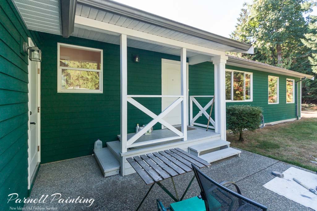
Why Choosing Exterior House Colours Can Be Overwhelming
Selecting exterior house colours can feel overwhelming – large surfaces, changing sunlight, and surrounding materials like hardscaping, landscaping and neighbouring homes all influence how colours look on your home. With a few key principles, you can confidently choose exterior paint colours that enhance your home’s style and curb appeal.
Pay Attention To The Fixed Elements of Your Home
Before picking paint colours, take note of what can’t be changed — the “fixed” elements such as the roof, brick or stone, railings, gutters, and natural wood. Your colour palette should harmonize with these materials.
- Roofing: (metal, shingles, terra cotta) Look at undertones — for example, gray roofs may lean blue or green. You don’t need to match them exactly, but your siding should complement the tones.
- Brick or stone: Notice any flecks of colour? Strong colours like red or orange brick will influence your exterior colour choices.
- Gutters and downspouts: if they are not being painted their colour needs to be taken into consideration in your overall colour scheme.
- Windows and trim: Window cladding (white, cream, brown, or black) affects how trim looks. For example, white vinyl windows with dark painted trim create a “picture frame” look, and vice versa — an effect that might not suit every home.
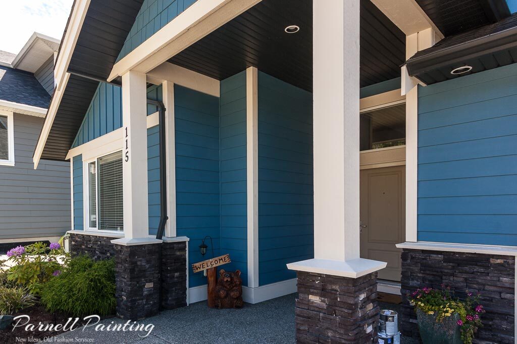
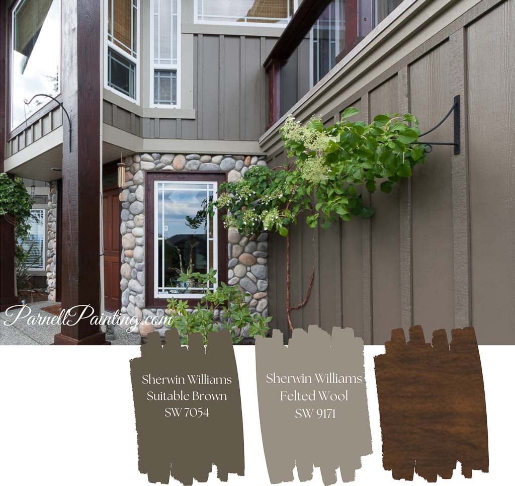
Example of exterior colours that complement the fixed elements of a home. An earthy brown palette was a natural choice, drawing from the tones in the brickwork, while the dark brown trim blends seamlessly with the matching gutters and downspouts. Explore the complete exterior colour update for this house.

Example Of A Cohesive Exterior: The warm gold siding below complements the stone around the garage and contrasts beautifully with the walnut-stained wood in the gables. See the complete re-paint for a Hardie Board house exterior.

Coordinate Colours With Hardscaping And Landscaping
Your house colour palette should work with the surrounding landscape, not against it. Use the nature around your home for colour inspiration.
- Homes surrounded by trees often look best in earthy tones and natural hues.
- Echo prominent flowers or a red maple tree on your front door for a cohesive feel.
- Consider how brick driveways, walkways, or stone patios tie into your home’s exterior.
How Natural Light Affects Exterior Colours
Outdoor light makes colours look lighter and cooler than expected. When testing paint chips, look at options two shades darker and slightly warmer than your initial choice.
Example of How Colour Appears Outdoors: The house below is painted with Sherwin-Williams Inky Blue, the same colour as the chip. Notice how natural light makes it appear brighter and cooler compared to the paint chip. See the full colour transformation for this house exterior.

Each side of your home will reflect light differently. You may need to prioritize one side when choosing colours— typically the front, for maximum curb appeal.
- South-facing walls can appear washed out.
- North-facing areas look darker.
- Shaded areas under trees or overhangs deepen the colour.
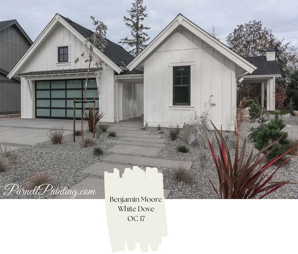
Example: This farmhouse uses Benjamin Moore’s White Dove OC-17. While warm and creamy indoors, it reads as a crisp white outside. View the full exterior painting of this stylish modern farmhouse.
Selecting the Right Paint Sheen for Exteriors
All things being equal, higher-sheen paints resist dirt better and are easier to clean. If your landscaping contributes to dirt splashing back or getting blown onto your house a higher sheen might be the best option. The drawback is higher sheens highlight imperfections and texture.
Choosing paint sheens comes down to a balance of aesthetics and ease of cleaning and durability. For most exteriors:
- Flat or low-lustre finishes work best on textured surfaces like wood, stucco, or Hardie Board.
- Satin finishes are often used for trim and doors, offering a subtle shine and more durability.
Sheen affects colour appearance – the same colour tinted in various sheens of paint will look different. Colours in higher sheen paint tend to look more intense.
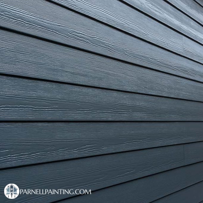
Hardie Board siding products can have a lot of texture and will look very different depending on the sheen of paint used. See the noticeable difference between satin sheen paint on the left that highlights the texture, while the flat paint on the right doesn’t due to the lack of reflection.

Common Mistakes To Avoid When Choosing Colours
Avoid these pitfalls to keep your house looking cohesive and timeless:
- Watch your undertones. Warm and cool tones can clash if not planned carefully.
- Don’t highlight unattractive features. Paint vents or utility boxes the same as the siding. Save the contrasting or accent colours for attractive architectural details.
- Stay neighbourhood-friendly. You don’t have to be a wallflower, but if you want to stand out, do it tastefully — don’t clash with nearby homes. Don’t pick colours that are too vibrant or bright unless they suit the particular style of your house.
- Limit your palette. Two or three colours are usually ideal, including trim and accents. Keep in mind that your roof, brick, stone work and other fixed elements are all colours on your house and contribute to the overall scheme. Too many colours on your house will make it look overly busy.
- Consider fading from sunlight exposure. Bright primary colours or dark colours can fade faster in direct sunlight. Subtrastes prone to warping like wood doors are at more risk if painted in dark colours.
- Understand how colours appear outdoors. Sunlight can make paint look lighter, cooler, or different than expected
Use Colour to Enhance Or Soften Architectural Details
Look at the architectural features on your house and decide what to highlight and what to blend in.
- Paint attractive decorative trim or gables in a complimentary colour to the house body or a contrasting or slightly darker or lighter shade.
- For busy façades, paint some elements the same colour as the siding to create calm and cohesion.
Below is a excellent example of a house that can benefit from a calmer colour scheme. It’s very busy with numerous, colours, shapes, lines and textures.

The new colour scheme ties in with the the dark stained entry pillars and upper deck railings. To calm some of the busy architectural details the vertical corner trims have been painted that same as the body colour, as well as the window trim above the upper deck patio doors. A remarkable difference! See the rest of this remarkable exterior makeover.

The house below had the opposite issue — it looked plain and lacked visual interest, with many of its architectural details blending in.
A new exterior colour scheme completely revitalized this home. The slightly deeper gray-green body adds character, while the livelier gable colour and charcoal entry doors create contrast. Painting the trim in a much lighter version of the body colour brought out the architectural details and gave the house fresh curb appeal. See how the new colour scheme looks on the rest of this Hardie Board house.


Why Muted Colours Work Well Outdoors
Bright, saturated colours that look appealing on paint chips can appear harsh or unnatural on large outdoor surfaces. Muted tones — colours with gray or earthy undertones — blend better with natural surroundings and age more gracefully. For example: if you like blue or green, choose a shade that has a slightly grayed-off tone versus a brighter version of the same colour.
Pay Attention to Undertones In Exterior Colours
Understanding undertones is key to choosing harmonious colours. Compare several options side by side — differences become more obvious that way.
To be able to pick colours that work well together and with the other elements on your home you need to get familiar with undertones. Once you understand how to identify the undertones in paint colours you’ll have more confidence in picking colours that coordinate with your home and its setting. The best way to see the undertones in a colour is by comparing it with other colours.
Example: Benjamin Moore’s Blue Heron has a violet undertone may not be that noticeable when viewed on its own, but becomes more noticeable when placed next to Van Deusen Blue — and can appear even stronger under exterior lighting.

Fade-Resistant Exterior Paint Colours
Modern paints include UV protectants, but bright and dark colours still fade faster than light, earthy tones. For longevity, opt for earthy, natural colours or toned-down versions of your favourites.
- Deep blues, greens, and reds may lose vibrancy over time.
- Muted neutrals and off-whites tend to last longest.
The photos below show how harsh sunlight affects vibrant paint colours. While the entire house has experienced some fading, the south-facing side — exposed to the most intense sun — has faded significantly more. See the dramatic before-and-after of this house re-painted in gray and white.

A Safe Approach: Use Shades from the Same Colour Family
A monochromatic palette is a timeless, low-risk option. It creates subtle contrast and visual depth without feeling busy.
- Mid-tone shade for siding
- Lighter shade for trim
- Darkest shade for the front door
Paint manufacturers typically have sample strips featuring a range of colours within the same family. The example below from Sherwin-Williams shows a monochromatic exterior colour palette that can be used in several ways. For instance, Intellectual Gray or Worldly Gray works well for the body, Alabaster for the trim, and the darker Porpoise for the front entry door and accent details.

Choosing the Right Garage Door Colour
Garage doors can be tricky — should they be the same as the body colour, the trim colour, or something different altogether? It depends on the colours being used, the style of the house and the location, size and number of overhead garage doors.
A guide to options:
- Match the trim colour for a balanced, unified look.
- Blending them in with the body colour works for some houses but it can take on the look of a monolithic structure for others.
- Most often you don’t want to draw attention to garage doors by painting them with an accent colour.
- Slightly lighter or darker tones than the main siding can add definition without harsh contrast.
- Consider using a shade or two lighter or darker than the house body to add definition without harsh contrast.
Where to Find Exterior Colour Inspiration
There’s no shortage of colour inspiration:
- Neighbourhood drives: Note colours you find attractive on homes similar in style to yours.
- Paint manufacturer tools:
- Benjamin Moore Personal Colour Viewer lets you upload photos of your home or use the provided ones to play around with colour. Sherwin-Williams Colour Tools offers similar software and downloadable brochures. Most paint manufacturers have both online and in-store brochures for inspiration and pre-selected exterior colour palettes to look at.
- Online platforms:
- Houzz — Search specific home styles and save ideas to a personal ideabook.
- Pinterest — Organize boards by home type, palette, or style (e.g., “Modern Exterior Colour Combinations”).
- Youtube – explore decorating tips and colour reviews.
- Decorator’s blogs – a wealth of colour information

Test Paint Colours Before You Committ
It’s nearly impossible to envision an overall colour on your house from a tiny paint chip.
Once you’ve narrowed your choices:
- Buy sample sizes – you can start by painting the colours onto poster boards so that you can move them around, but make sure you eventually test directly on your house and siding.
- View samples at different times of day — morning, afternoon, and evening light all affect colour.
- Compare colours beside fixed elements like brick or stone for the most accurate read.

Bring Your Vision to Life with Parnell Painting
Ready to update your home’s exterior? We are a husband and wife team that have been providing high-quality interior and exterior house painting in Nanaimo for over 20 years. We can offer colour advice to give your home a fresh new look. Contact us by phone or email to schedule your free, no-obligation quote.