• Skip to primary navigation
  • Skip to main content
  • Skip to footer

Parnell Painting

New Ideas, Old Fashion Service

  • Parnell Painting
  • About Parnell Painting
  • Estimates & Services
  • Parnell Painting Client Testimonials
  • Portfolio Of Work
    • Exterior Painting Portfolio
    • Interior Painting Portfolio
  • Painting Tips
  • Preparing A House For Sale
  • Choosing Paint Colours
  • (250) 585-7222
  • contact@parnellpainting.com

Interior Painting Portfolio

A Dark Living Space Is Transformed With Light Greige Walls

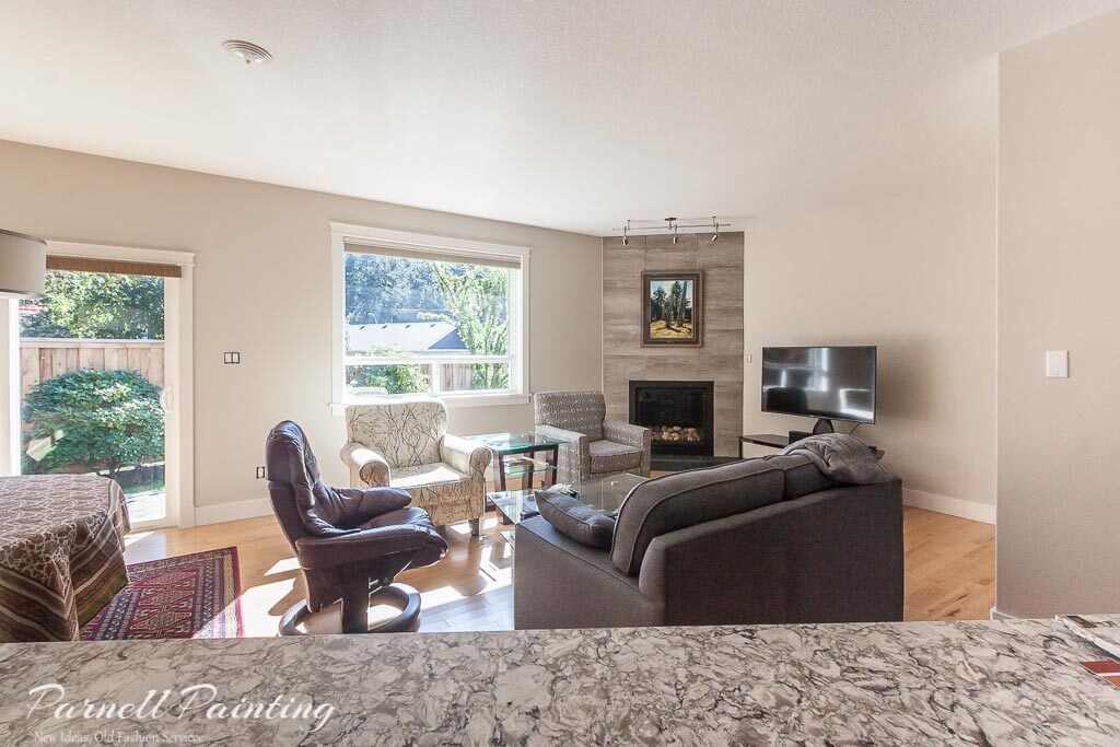
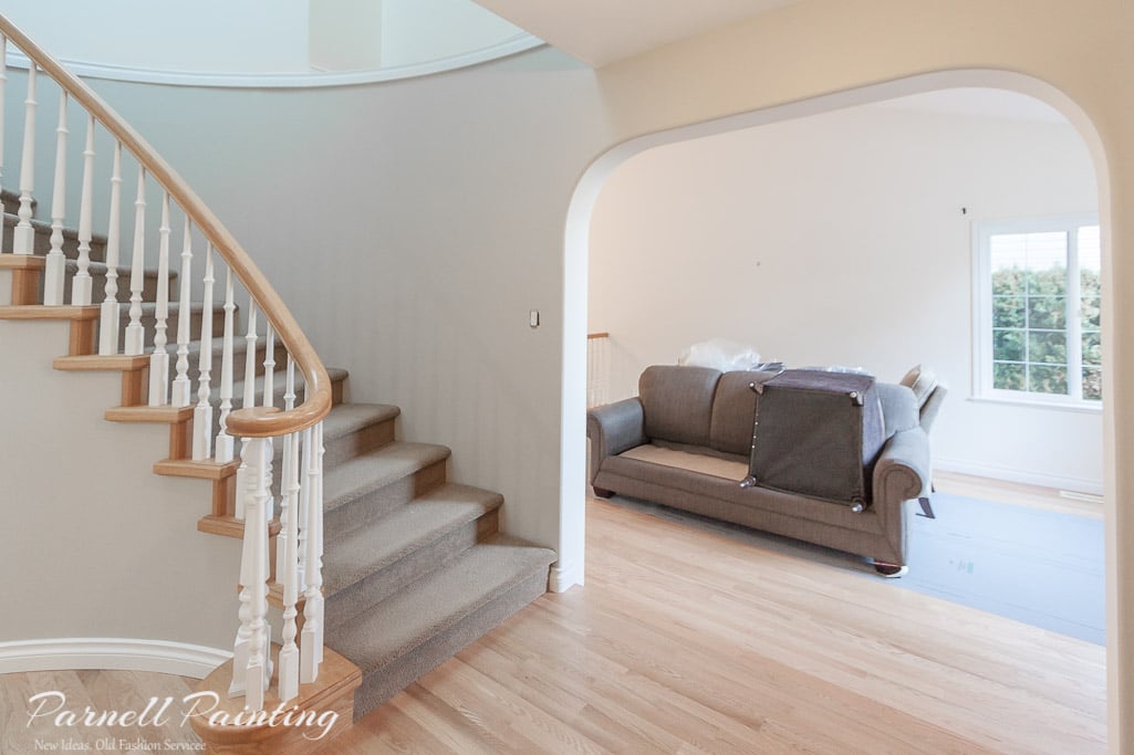
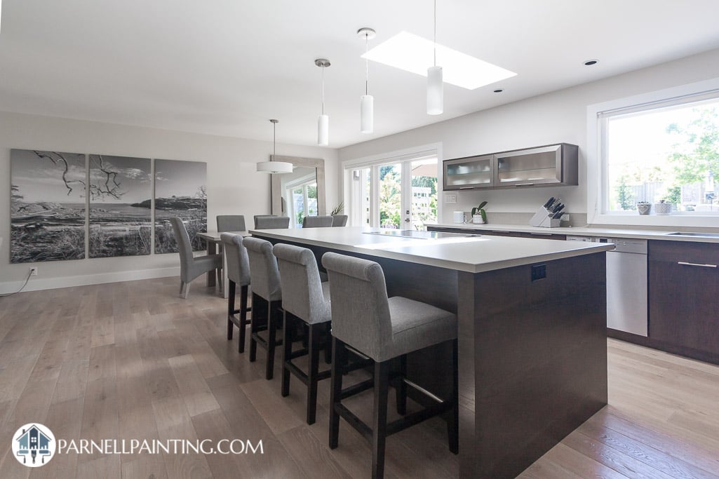
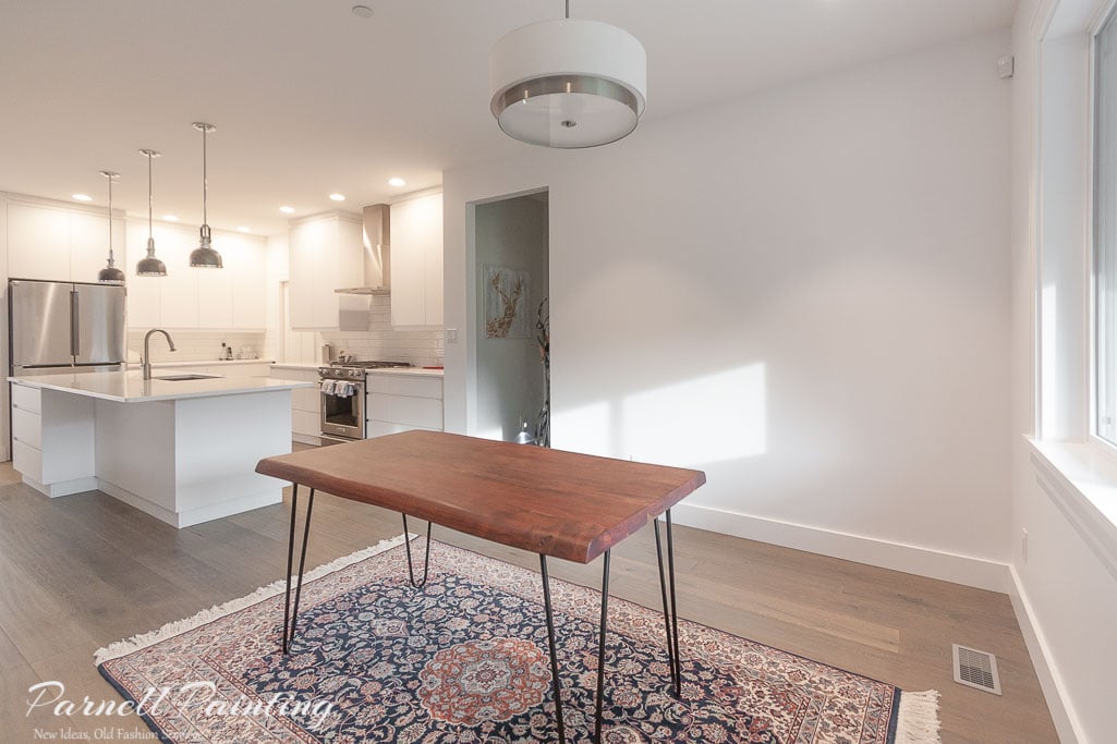
The trend for interior repaints continues to be about making spaces lighter and more neutral. In keeping with the trend these owners were ready to move on from the dark green walls and onto something that would brighten up their home.

We were hired to repaint the open concept living, dining and kitchen space and the entry and hallway walls with Benjamin Moore’s Edgecomb Gray. It’s a popular warm neutral colour that is considered a greige (a blend of gray and beige).

Before we painted the homeowners said they frequently had to turn on lights during the day because it was so dark. Lighter paint colours can’t create light, but the new wall colour will reflect much more of the natural light that is available.

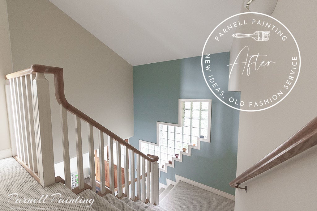
The drastic change in the wall colour has made it look like a different house.

Refreshing A Vacation Condo In A Warm Golden Colour

As you can expect in any vacation property the walls and trim work get constant dings from suitcases coming in and out and over the years there is accumulated wear and tear. It was time for this vacation condo to have a refresh. The reviews for this vacation condo were starting to mention condition of the walls. It was definitely time for some T.L.C. and a refresh of the paint.

The customer requested to have the unit painted in the same colours. We didn’t have the original colour information so we matched as closely as possible to golden sand walls and white trim work. The smooth ceilings that run throughout the kitchen and hallway had become marked up so they were painted as well. The unit is back to being in tip top shape and after the pictures are hung back on the walls it will be ready to rent out again.

Repainting A House In A Lighter Warm Neutral Colour

This repaint is a great example of how different a home can look with a new paint colour. The owner wanted the house to be brighter, but did not want it to feel cold. They had already painted a few rooms in a light creamy colour called buttermilk and liked it. They decided to have us paint more of it throughout the house. The buttermilk colour acts as a warm but neutral colour. This is perfect because they may decide to sell in the near future and it will be appealing to a wide array of potential buyers.

The darker yellow living and dining rooms walls were repainted in the buttermilk colour.

The space feels brighter and provides a blank canvas for furniture and artwork of any colour or style.

The stairwell went through the most dramatic change. The light yellow walls were repainted in the buttermilk colour and the darker red walls in revere pewter. The new colours compliment the flooring and the wood work.

Calming down the colours has created a relaxed, but elegant feel to the home.

Repainting A Bland Beige Interior

The owners purchased this home because of the beautiful ocean views and spacious layout, but they knew they were going to paint soon after moving in. They found the colour scheme to be far too bland. The same beige paint was used throughout the house on all the walls and the ceilings. To add to the monotony of colour the room doors were a slightly darker beige and the carpets are beige too!

This is the new view the owners get to see when they come down from their bedroom in the morning. What an improvement! A light cream from Benjamin Moore was chosen as the main wall colour. It’s called Elephant Tusk. Buxton Blue was used as a feature wall in the stairwell and entry area.

The ceilings in most of the rooms are only eight feet high. The beige colour made them feel low and heavy.

It took three coats of paint to change the ceilings to white, but it was well worth it as you can see in this after photo. The feature wall in this living room is Benjamin Moore Aegean Teal.

Changing the ceiling to white improves every space in the house. It allows more light to be reflected.

The room below will be used by one of the owners to practice their cello. They wanted a calm space and it was achieved by painting the walls in First Light. It was Benjamin Moore’s 2020 colour of the year with just the right amount of pink.

The Buxton Blue feature wall continues up the stairwell and through to the upper hallway.

The family room was yet another space with beige wrapped right up the walls and onto the ceiling. It remains a cozy place to watch television with Elephant Tusk on the walls and brighter with a white ceiling.

More beige in the bathrooms, along with a look at the beige doors that were throughout the house.

The new look is bright and cheery. We custom colour matched the door paint to get as close as possible to the existing trim work colour.

The primary bedroom starts to look brighter with only part of the ceiling painted white.

Benjamin Moore October Mist makes for an excellent feature headboard wall. It’s a muted green gray colour. The lighter creamy Elephant Tusk colour helps to further lighten the room.

There’s no fear of using colour here! Orange is known to inspire creativity, which is fitting for this space. One of the owners is an author who will use this room to write in. It’s Benjamin Moore Corlsbud Canyon.

Crisp and precise cut in lines are always important where the top of the walls and ceiling meet, but even more so when you’re working with a colour like this. There’s no hiding any errors or anomalies.

The owners goal was achieved. The house is no longer a boring sea of beige, it has life and character.

Repainting A Vacation Cottage In A Lighter Warm Neutral

A remarkable before and after accomplished with nothing more than a change in paint colour. The dark green walls and mustard colour trim were making this vacation rental feel dark and drab.

It took three coats of paint to change the mustard colour trim to white, but it was well worth it. The pairing of a warm neutral on the walls with the white trim work and doors has made the cottage bright and inviting. The owners have been enjoying the new look and it’s sure to be appreciated by any future guests.

The new wall colour has a warmth to it that compliments the floors and woodwork.

Every room of the house has been transformed into a welcoming space, especially the bedrooms.

The bathroom had too many competing colours that have your eye bouncing all over the place.

Now it looks coordinated and there’s a new appreciation for the wood vanity.

The walls will act as a neutral backdrop for the artwork once it’s put back up.

Ranch House Walls Painted With Aesthetic White

This house interior was originally painted in shades of greige that were popular at the time, but quite dark. To make the home feel brighter the walls were re-painted in an off-white colour from Sherwin Williams called Aesthetic White. It’s actually considered beige, but does not have the golden undertones that some beiges have. It leans slightly towards gray.

The trim work and doors were not in need of painting, but even though they looked white there was an undertone that did not work well with the Aesthetic White colour. This is something you have to be prepared for when changing your walls to very light colours or white or off-white. If your trim work is not close to a true white you may have to re-paint it.

The photo below shows the original darker greige walls that were throughout the house.

The remaining photos are the Aesthetic White colour. The exception is the primary bedroom and one of the bathrooms. The tint formula for Aesthetic White was doubled to give those rooms a bit more depth and warmth.

When looking through the photos you can see how Aesthetic White changes depending on the light. In some areas it looks more gray.

White Walls And Trim Work

The walls of this open concept living space went through a subtle, but impactive change from light gray to white. The owners wanted the walls to become a gallery backdrop for their collection of vibrant artwork. The paint colour chosen was Benjamin Moore Chantilly Lace, it’s crisp and clean looking and about as close to pure white as you can get.

When changing the walls to a colour this white you need to be prepared to paint more than the walls. Your ceilings may appear white, but there’s a good chance that they have a distinct undertone. When paired with crisp white walls the ceilings can end up looking dingy or have a yellow, blue or pink tone. In this case we painted the ceilings in the same Chantilly White, but in flat ceiling paint.

The trim work was also done in Chantilly Lace, but to create a bit of contrast between the trim work a different sheen was used. In this case it was matte for the walls and satin for the trim work. When painting your walls white you need to follow a general rule of thumb. The trim work and walls should either be the same white colour or different enough that it looks intentional, keeping in mind that mismatched whites can look very off putting.

Preparing to paint the ceilings is quite a task, everything needs to be protected from any over spatter of ceiling paint. In this particular case the home owners arranged to have the painting done while they were away on holidays. In a smaller rancher house like this one, it’s an excellent choice. It would be somewhat challenging for the homeowners to stay at the house during the painting work, at least the initial part of it.

Taupe And Green Open Concept Living Space Repainted In Balboa Mist

The original painting was not done well in some areas of this home. It’s only had one paint job and some of the walls felt rough so our guess is that the sanding was not adequately done after the drywall was primed. In addition the paint was applied far too heavy in the tall entry and hallway, perhaps in an attempt to do only one coat. This left excessive texture, rolling irregularities and paint sagging. We spent hours sanding down the walls to smooth them out before re-painting.

The large open concept living space was originally painted taupe with several darker green accent walls. The clients had us re-paint with Balboa Mist. It’s one of Benjamin Moore’s go-to neutrals and considered a pale greige. Greige colours have been a popular choice over the last few years as homeowners have wanted to transition out of the gray trend and into something more timeless and warm. Balboa Mist amplifies the light well in this large open space giving it a light and airy feeling.

Repainting Dark Walls In A Light And Warm Off White

This owner was ready for a colour change and wanted to lighten up the walls of the main floor of their home. They chose the colour Fossil from Benjamin Moore. It could be considered a warm off-white or a very light beige. The new colour works well with their living room furniture and the rooms look so much brighter and spacious.

A Full Repaint Of A Home Prior To Move In

This is the second time we’ve had the pleasure of painting for these clients. They moved to this charming little strata home and made prior arrangements to have us start painting on the day after their possession date. Most of their furniture and belongings, other than essentials were stored in the garage until we were done. This made the painting process more efficient, especially while we were painting all of the ceilings. The walls were done in a greige colour and a warm white was used for the trim work and doors. It’s ready to settle into and decorate.

  • « Go to Previous Page
  • Page 1
  • Page 2
  • Page 3
  • Page 4
  • Interim pages omitted …
  • Page 9
  • Go to Next Page »

Footer

About Us
Our Estimates
The Services We Offer
Interior Painting Services
Exterior Painting Services

Client Testimonials
Inteior Painting Portfolio
Exterior Painting Portfolio

contact@parnellpainting.com
(250) 585-7222

Check Out Our Socials

Instagram


Facebook

Copyright © 2026