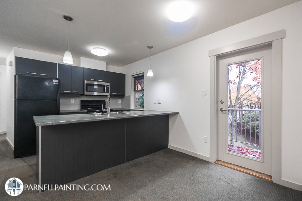
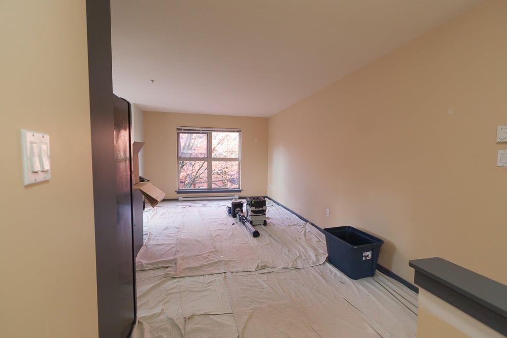
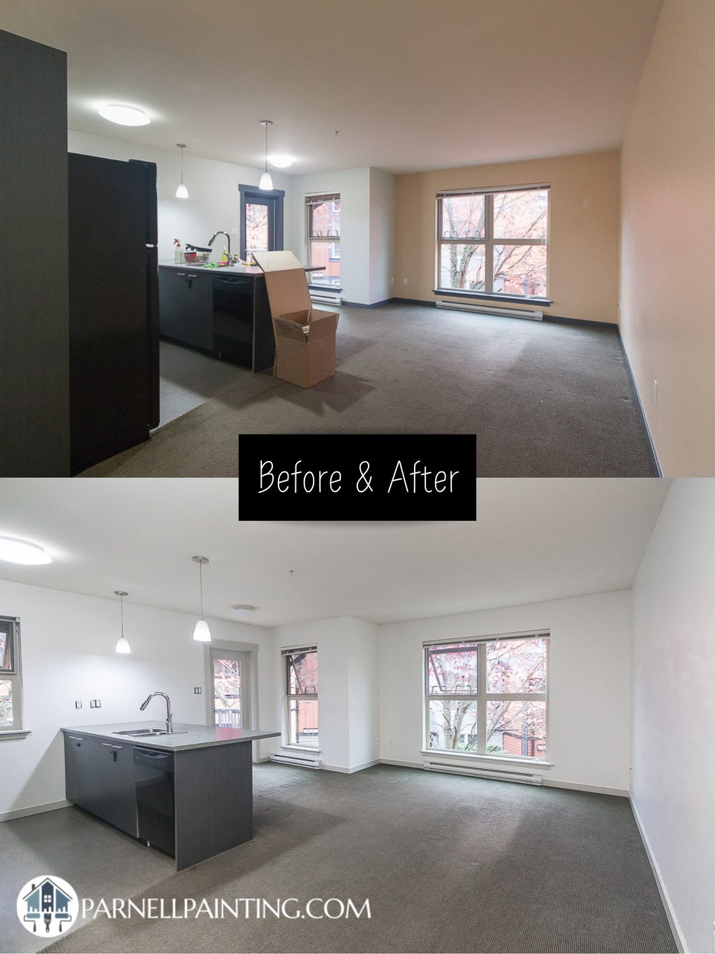
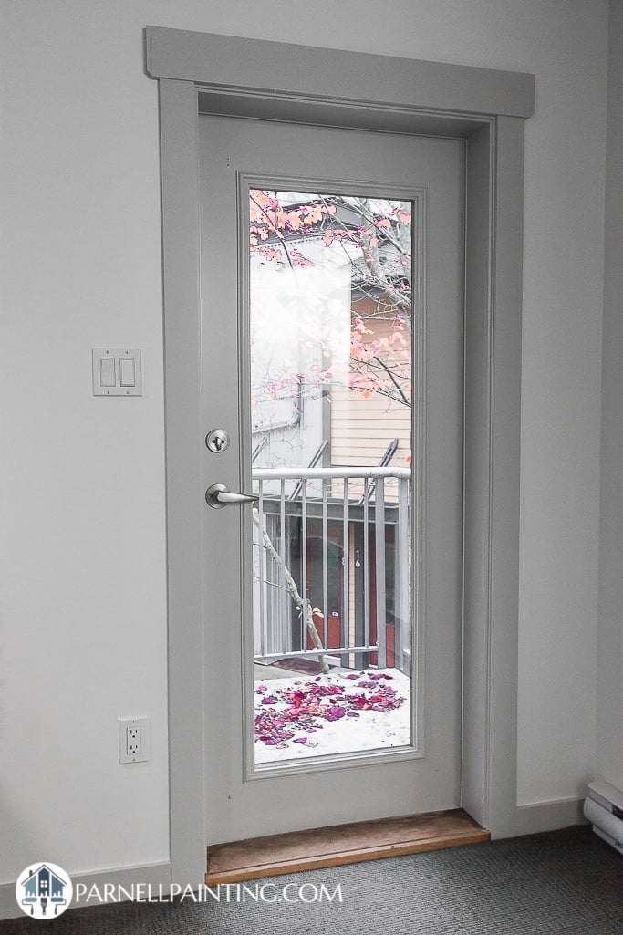
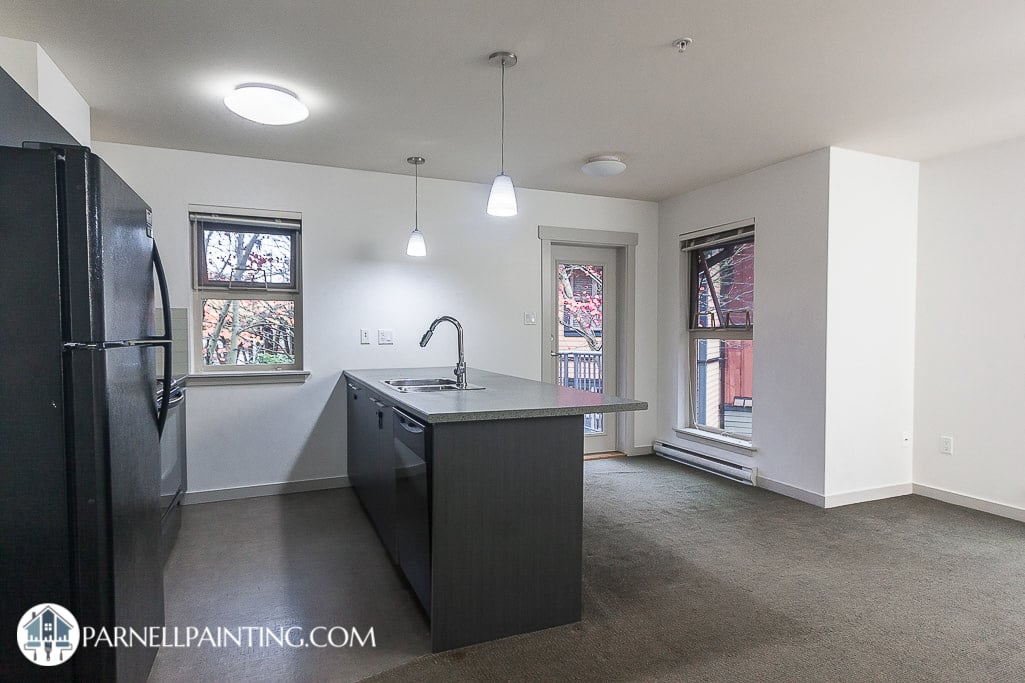
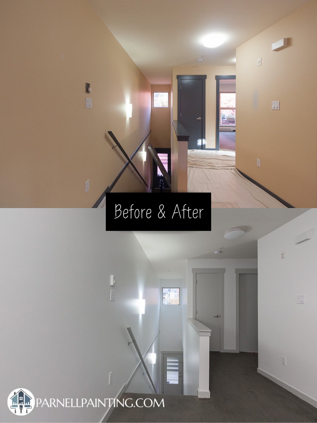
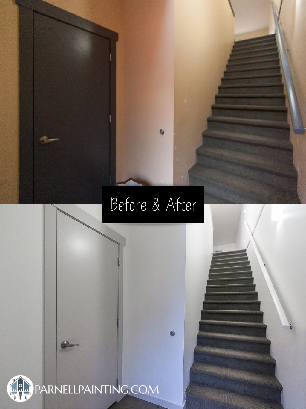
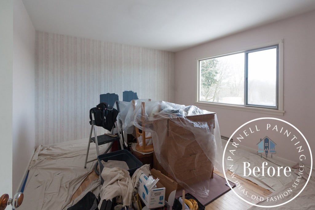
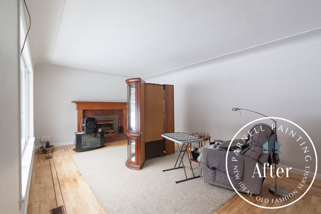
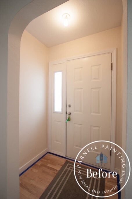
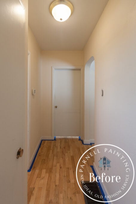
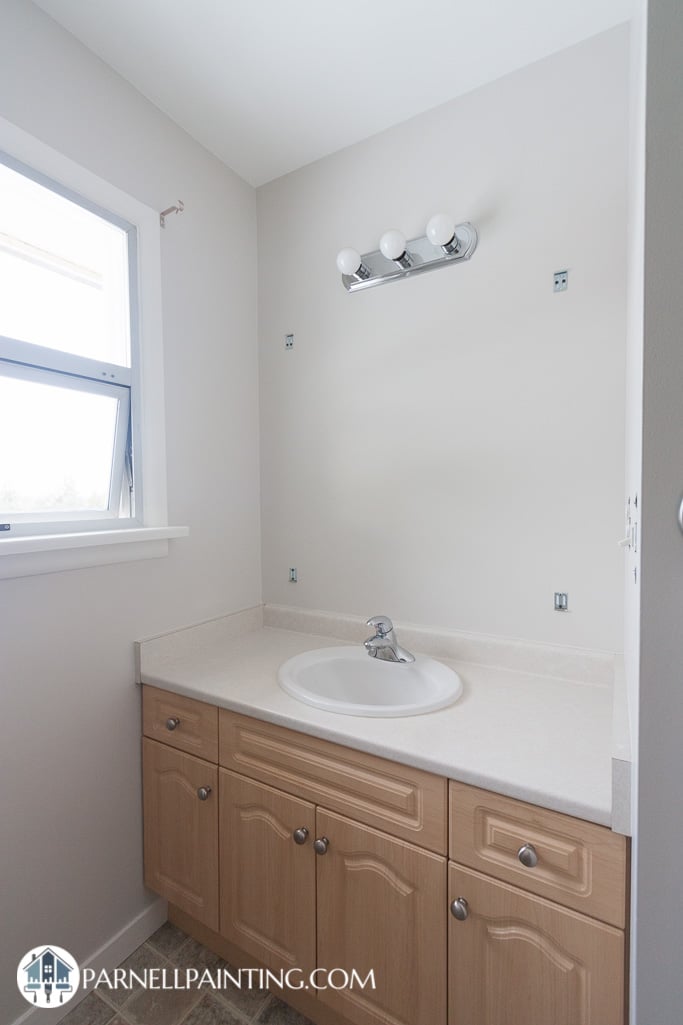
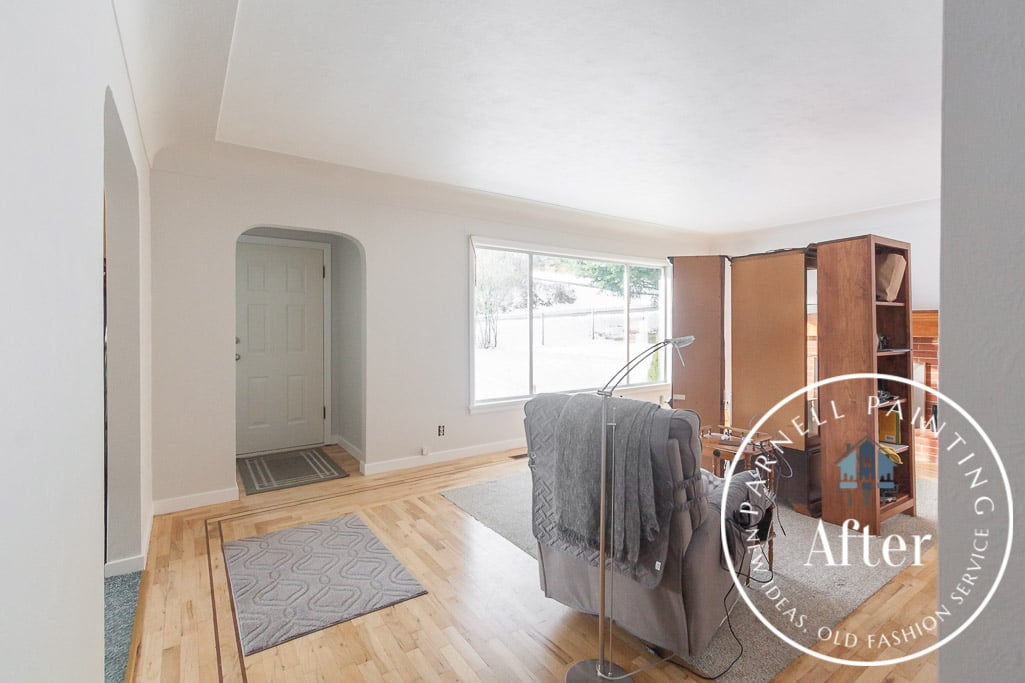
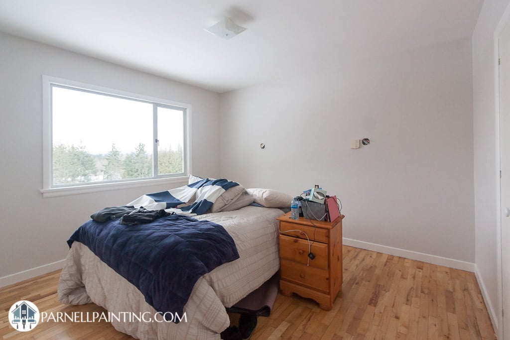
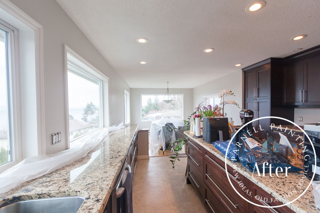
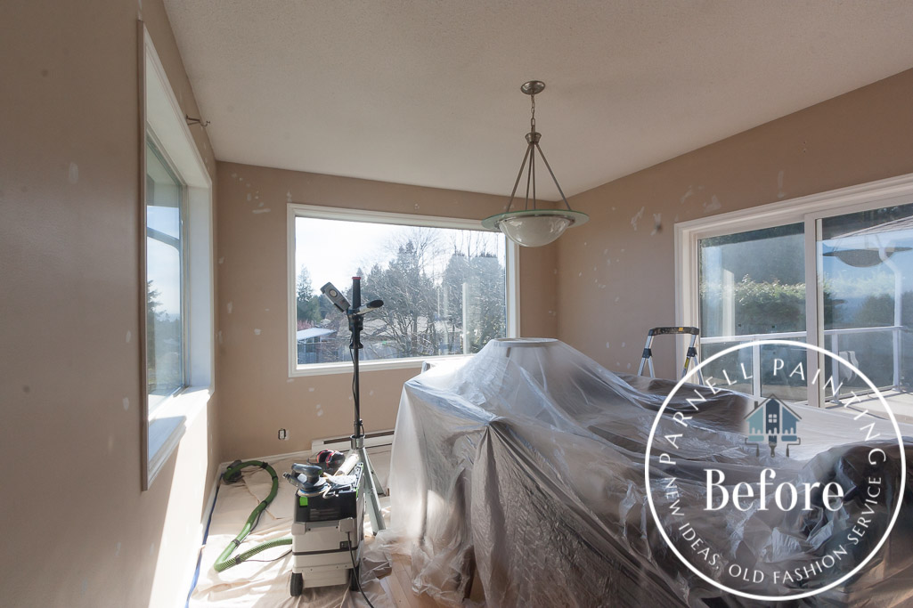
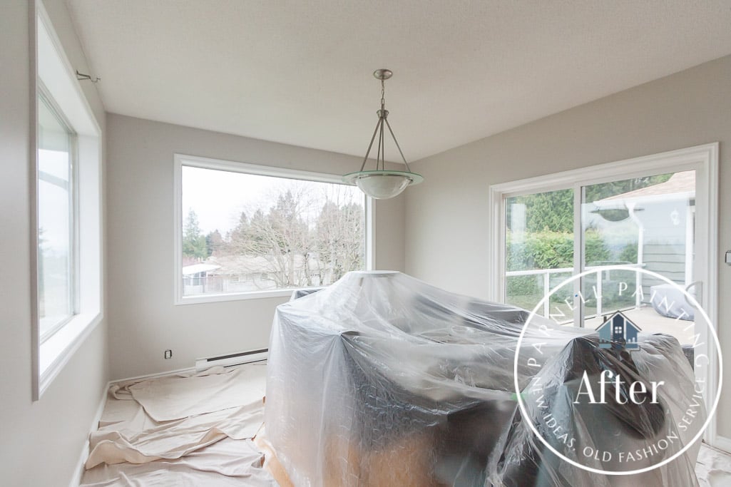
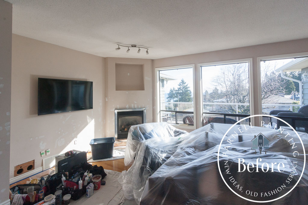
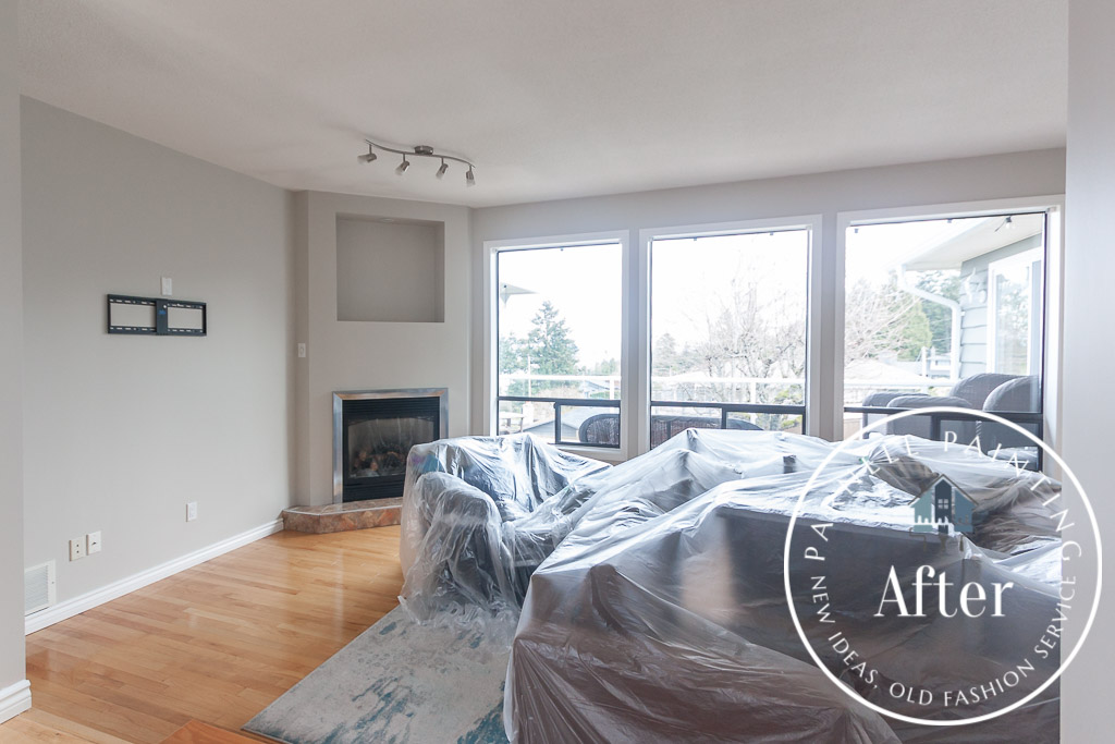
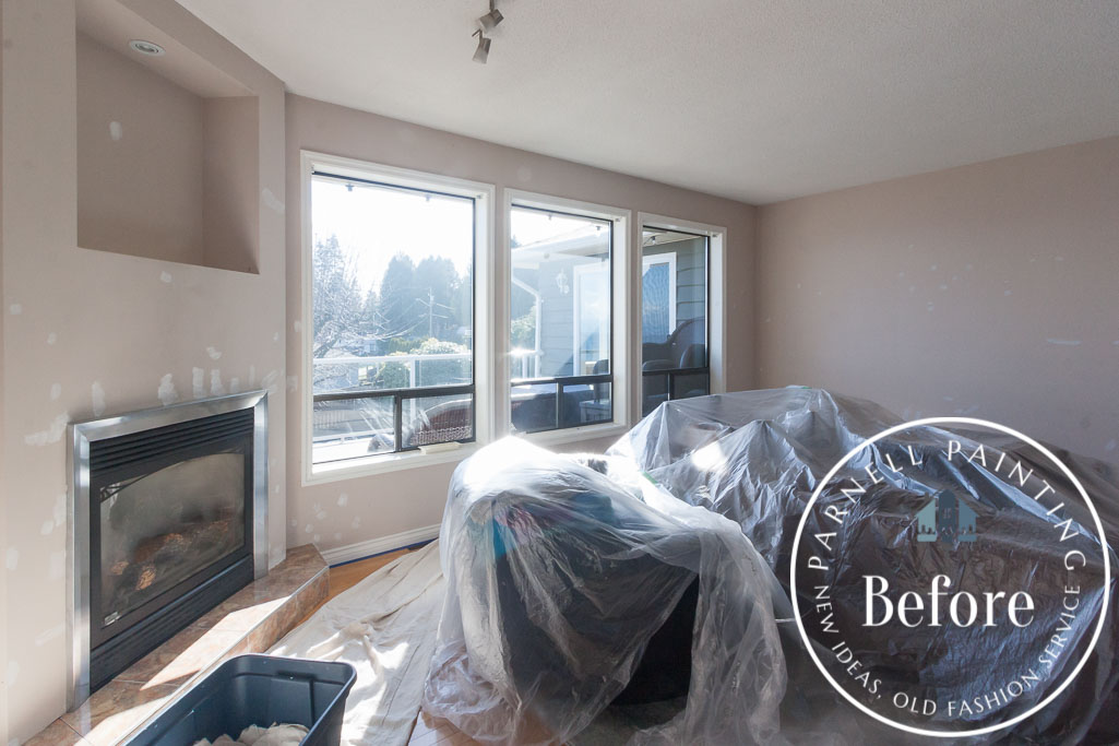
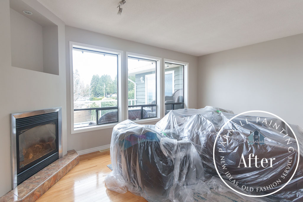
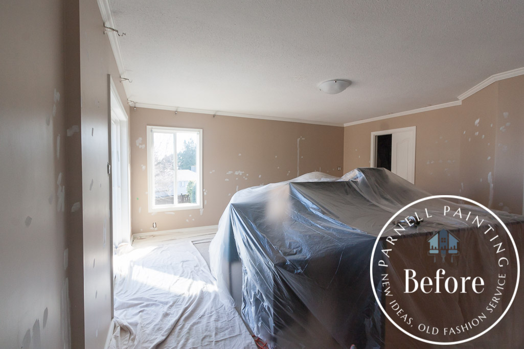
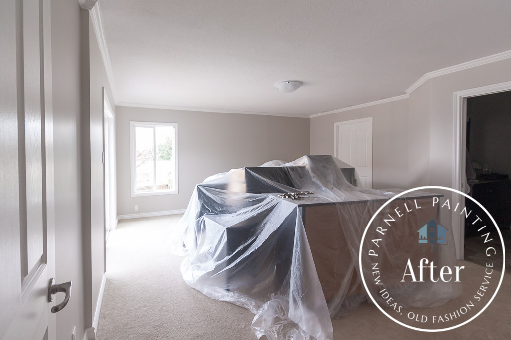
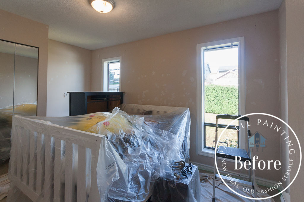
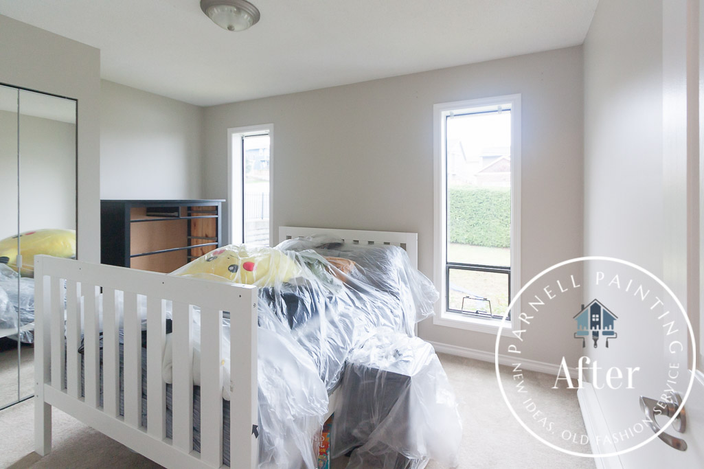
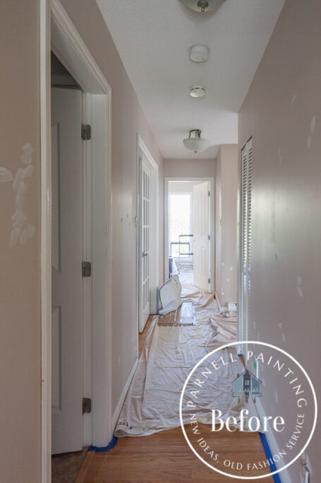
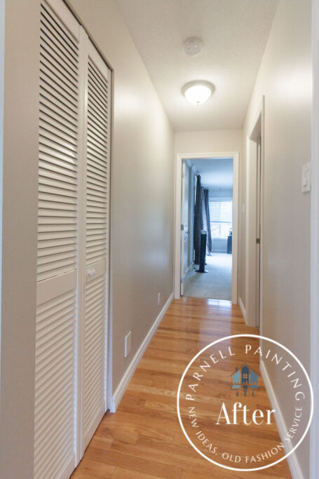
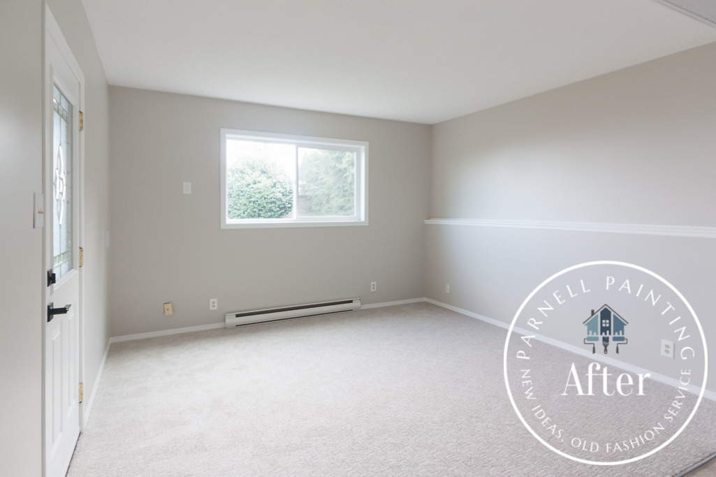
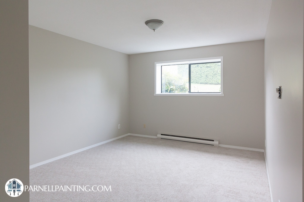
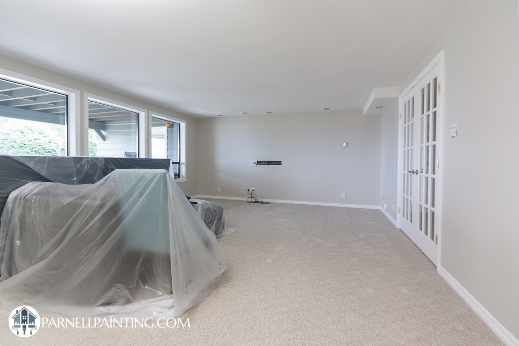
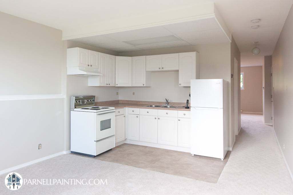
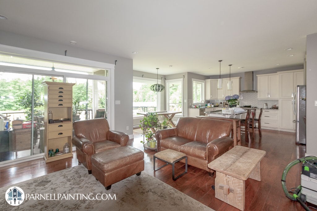
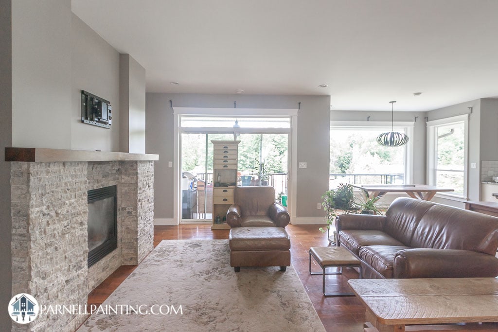
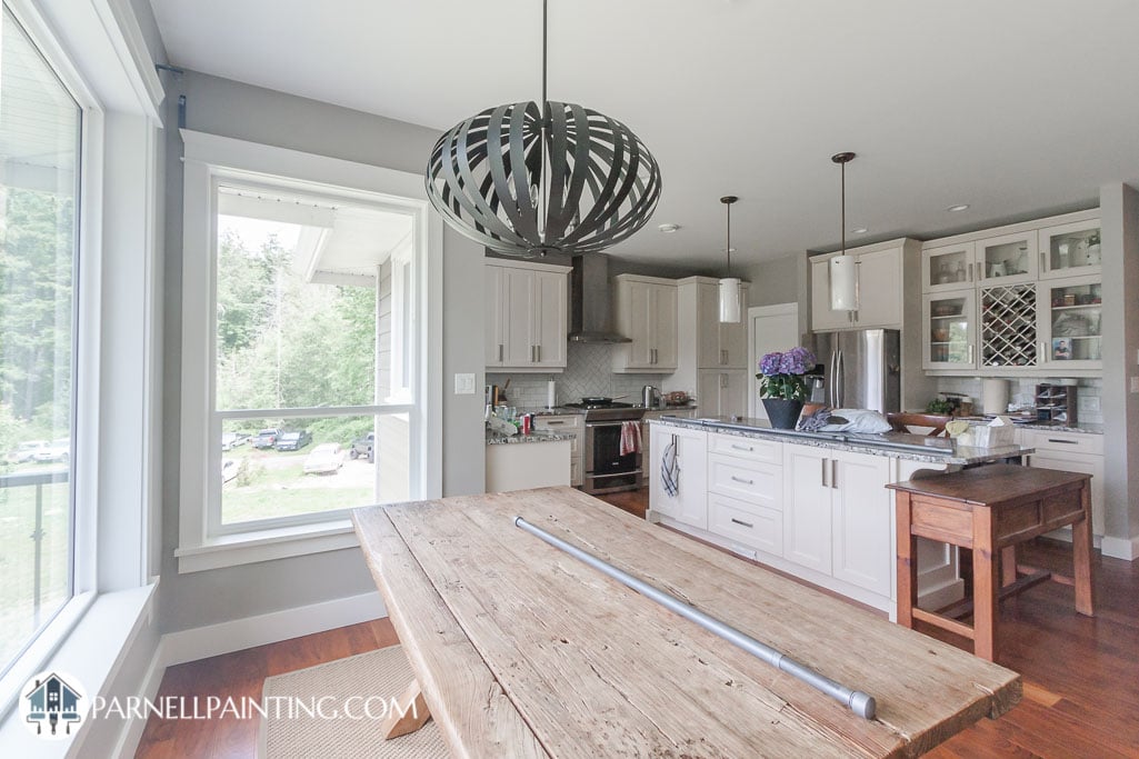
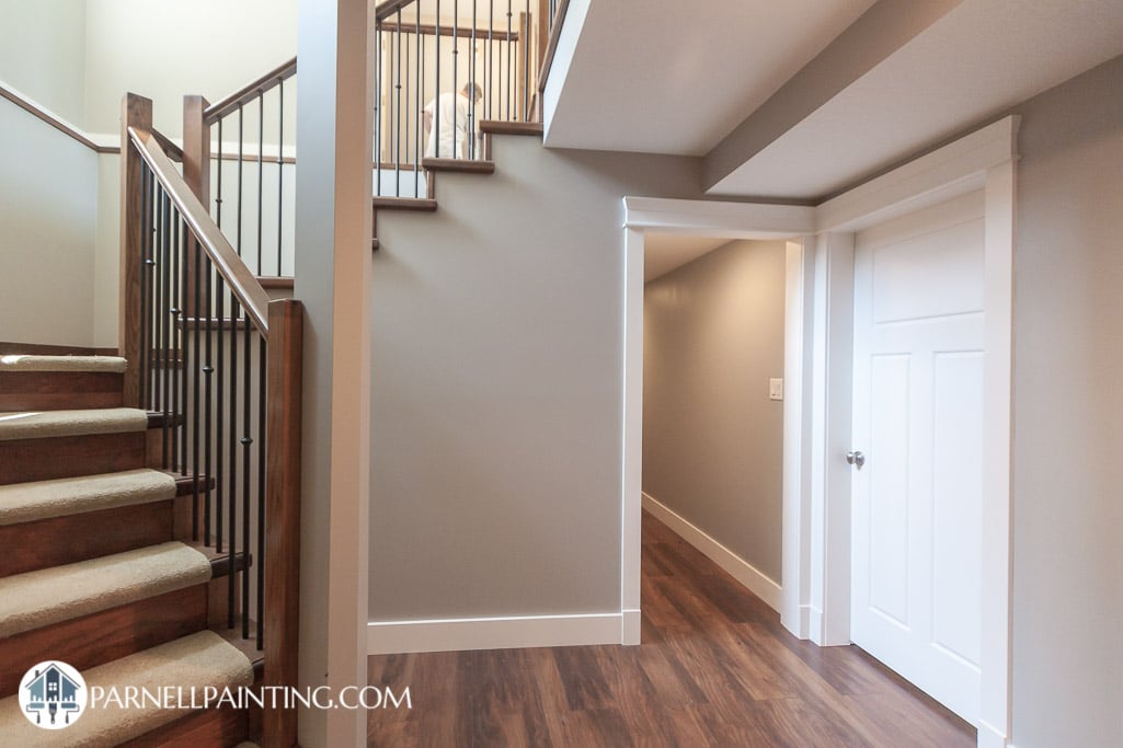
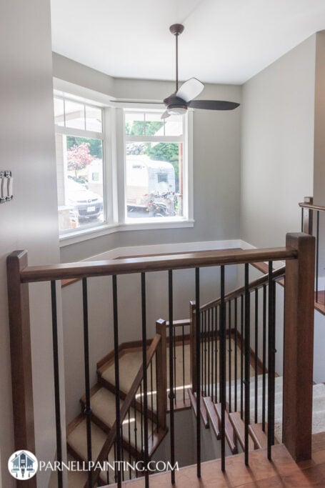
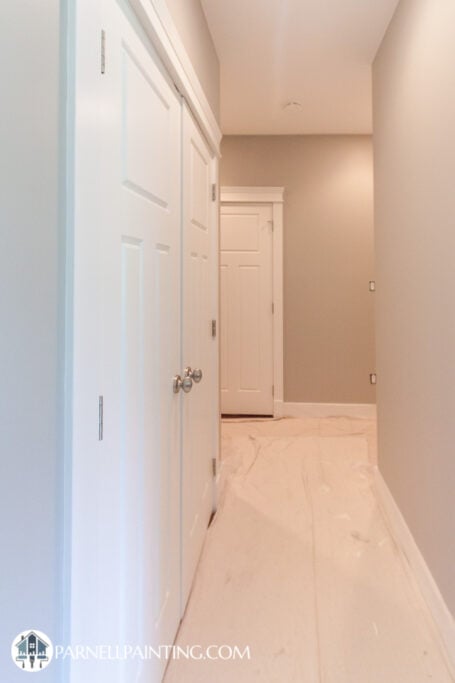
This townhome was being prepared to rent out. The owner wanted to change the yellow walls and dark blue trim work and doors to colours that would appeal to a wider range of potential tenants.
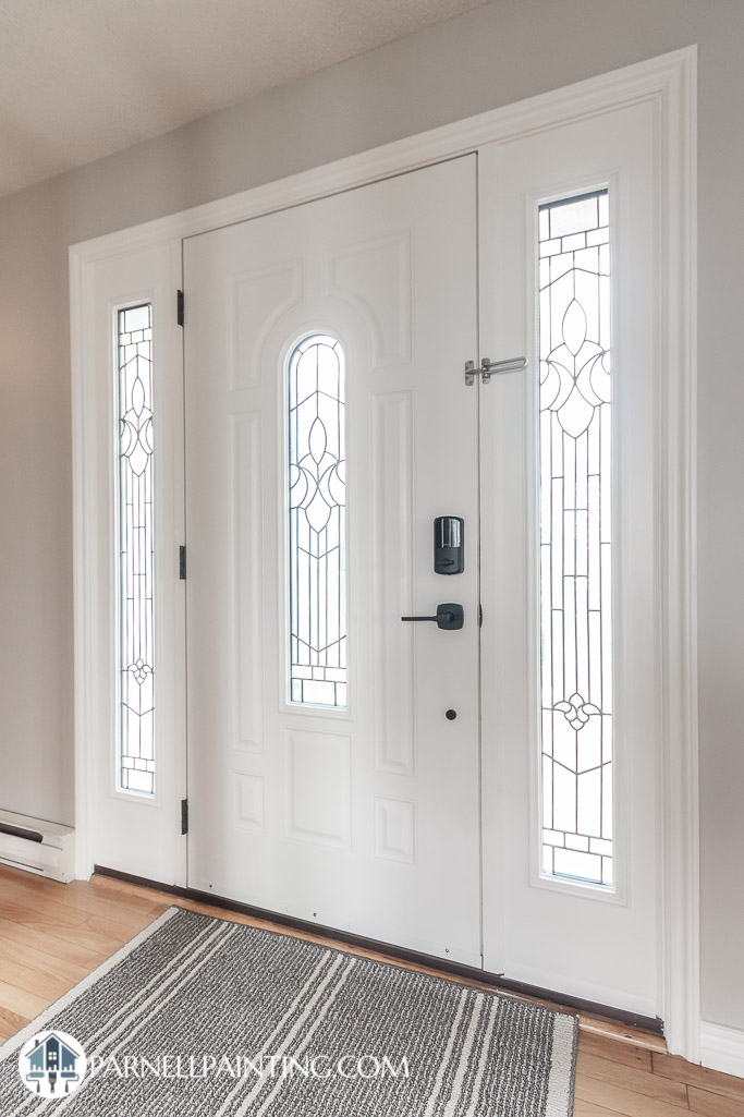
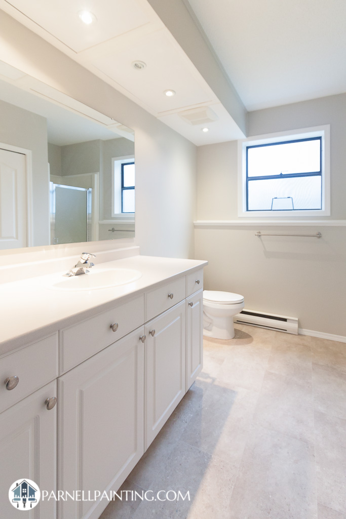
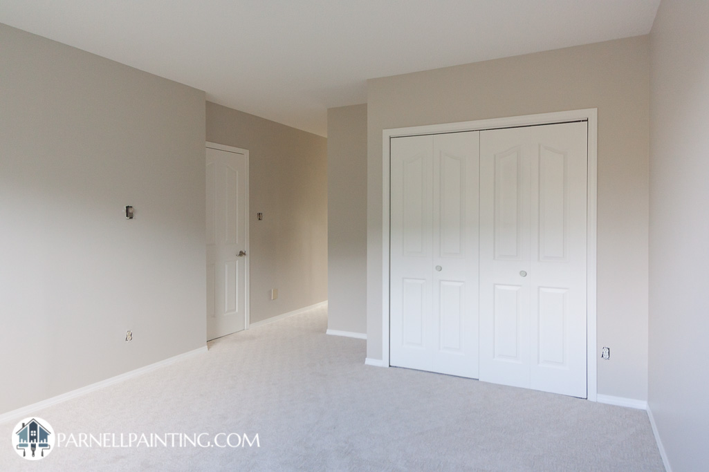
We repainted the walls in an off-white Benjamin Moore called White Dove. Instead of changing the dark trim work and doors to white we took an easier route and painted them with a gray called Revere Pewter. This is a popular colour combination that creates a sophisticated look with the warmth of White Dove complimenting the warm gray of Revere Pewter.