Colour has a powerful impact on how we feel in our homes. The right interior paint colours can make rooms feel larger, cozier, or more vibrant, while influencing mood and energy. When choosing colours, consider not only aesthetics but also the psychological effect each shade can have on daily life.
Ready to explore the best interior paint colours for your home? Learn more about choosing interior colours to find expert tips, inspiration, and guidance for creating the perfect mood in every room.
The Psychology of Colour in Your Home
Colours evoke emotion. Soft tones create calm and relaxation, while bright or bold shades energize a space. The feelings a colour produces can affect your comfort, focus, and overall enjoyment of a room. Before selecting paint, think about the mood you want to create and how your furniture, lighting, and décor will interact with the colour.
Determining the Mood You Want
Explore decorating websites, magazines, or paint company brochures for inspiration. Ask yourself why certain colours appeal to you. For example: Soft, cohesive shades can make a bedroom feel serene and restful. Brighter or vibrant tones can energize kitchens, creative spaces, or home offices.
Example: This bedroom achieves calm and warmth through soft shades and a consistent palette throughout the room.
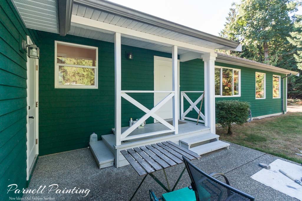
For more inspiration on creating a calm, inviting atmosphere, see the rest of this home’s beautiful interior here: ranch-style home painted in Aesthetic White.

How Colours Affect Room Perception
Light colours can make rooms feel open, airy, and brighter, while darker colours can add warmth, intimacy, or dramatic flair.
This townhouse living space was painted a light neutral to serve as a blank canvas for a large art collection, creating a bright and open feel. See more of this townhouse transformation here: Changing the wall colour of a new townhouse from brown to white.

Colour Guide
Red Colours
Red energizes and stimulates conversation, but it should be used selectively. In some rooms, it can feel overwhelming, so it is generally best applied as an accent colour. Muted or earthy reds, however, create a cozy and comfortable atmosphere.
Orange Colours
Orange is associated with action and can stimulate energy and creativity. Bright shades of orange are cheerful. This is an ideal colour for creative spaces like studios or hobby rooms and for fitness areas.


Pink Colours
Soft pinks calm and reduce stress, while vibrant pinks can be stimulating. Combining pink with grays or blacks creates a sophisticated, elegant look.
Example: This is going to be a music room for cello practice. It uses just the right shade of pink to feel sophisticated and elegant. A brighter or more intense pink could appear garish, but this soft tone creates a refined, welcoming atmosphere.
Yellow Colours
Yellow can emit a feeling of sunshine. It can be uplifting, welcoming and somewhat energizing. Yellows that are too intense like sunflowers can be hard to live with. Muted or softer shades of yellow are best to use if used in an entire room. Yellow tends to be a love it or hate it colour for many people.
Example: The soft yellow walls create a cheerful, bright atmosphere in this family kitchen. This gentle shade is an excellent choice for rooms that receive limited natural light, helping to make the space feel warm and inviting.


Gold Colours
Example: This gold colour used as the accent wall creates a completely different feeling than the cheery yellow in the photo above. The rich depth and warmth of gold gives a sense of sophistication, but still looks cozy and welcoming.
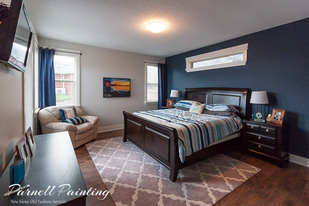
Blue Colours
Blue can be calming or dramatic depending on the shade. Light blues promote relaxation, deeper blues make bold statements. Some blues can also inspire creativity, making them ideal for studies or offices.
Example: This customer choose a blue for their master bedroom. It has quite a bit of depth, but with a warm undertone that creates a relaxed atmosphere.


Example: This ensuite bathroom is under construction, but you can see the blue chosen for the walls is going to create a calm feeling like a spa setting.
Example: The bold blue chosen for accent wall in this primary bedroom creates a bold, but sophisticated statement.

Green Colours
Green is closely associated with nature and can evoke a range of moods depending on the shade. Lighter sage and muted earthy greens feel refreshing and calming, making them easy to live with, while darker greens can feel bold and intense. It’s a colour that often inspires strong reactions—people tend to either love it or hate it.
Example: The muted, sage green feature wall in this bedroom mimics the nature outside the windows and creates a sense of calm and tranquility.
Example: The rich, earthy green used in this space that will become an office grounds the room and gives it a sense of purpose.


Purple Colours
Purple adds elegance and creativity to a room, with the effect depending on the shade. Light lilacs create a calm, restful atmosphere, while deeper purples offer a sophisticated, dramatic look. Pairing rich purples with neutrals balances the space, making it ideal for accent walls, creative rooms, or stylish living areas.
Example: The lighter lilac used in this bedroom creates the perfect space to rest with a soft, calming effect.
Example: The vibrant walls of this young girls bedroom create a sense of a space of elegance and whimsy.

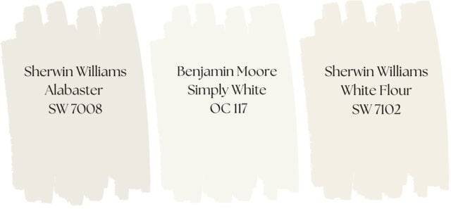
Neutral Colours
Blacks, greys, whites, and browns are considered neutral colours. A room painted in neutral tones can feel calm and cohesive when paired with furnishings and décor in similar shades, or it can be enlivened with bold accent pieces. Black works best when used sparingly as an accent.

Example: This living room has warm, off-white walls. There’s minimal contrast in the decor which creates a relaxed feel. Most of the interest comes from different materials and textures.
Example: A complete sense of tranquility and calm has been created in this living room with the walls and almost all of the decor in the the same soft, warm white colour. At the same time it looks very sophisticated. View more of this elegant home here: Repainting a classic interior.


Example: This living room walls are a light, warm white. The neutral palette leaves the homeowner with the choice to go in many different decorating directions. They could do tone on tone, high contrast or something in between. See the rest of this paint job as an example of how you can use warm white throughout a home: Painting warm white throughout a two storey house.
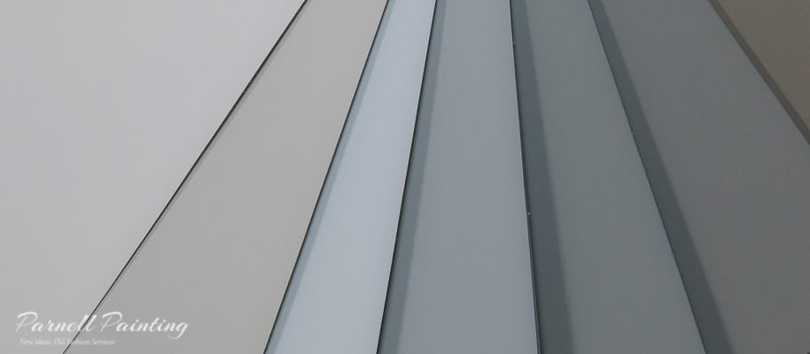
Gray Colours
Gray colours can create varying moods depending on the shade and depth. Light grays can create calm and airy spaces, while dark grays can feel dramatic and sophisticated. You have to be careful when using gray, it can feel industrial, monotonous or even gloomy in spaces without adequate light.
Example: Darker grays can be used to create contrast between walls and trim or a dramatic feature or accent wall like in this townhome. See how the rest of this home was is transformed here: Modernizing a townhouse with a light neutral walls with a dark charcoal accent.


Example: In this dining area, a gray just a few shades deeper than the surrounding walls serves as an accent. The colour scheme maintains a calm, cohesive feel versus the contrast that a darker wall would create. See the rest of this condo taken from dated to modern: A condo update from peach walls to gray
Example: The soft gray walls in this bathroom create a calm, spa-like atmosphere — the perfect space to unwind and relax. See the rest of this house for the new modern look: An update for an open-concept house from gold walls to cool gray


Example: The gray walls in this home, paired with the rich wood tones and modern fixtures, create a sense of refined, contemporary elegance. See the rest of the updated rooms in this house painted with Benjamin Moore Silver Satin: Main living area colour changed to Silver Satin
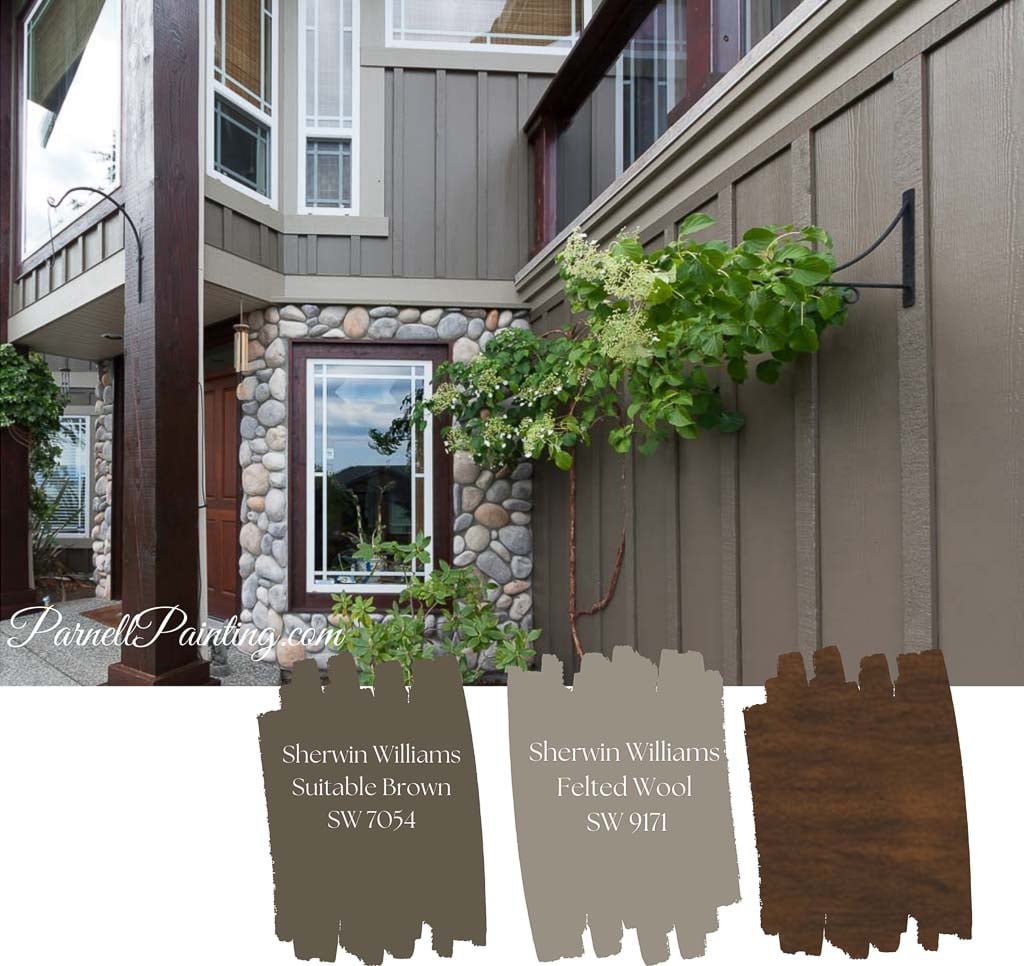
Brown Colours
Brown tones create a comfortable, grounded atmosphere. Lighter shades work well as background neutrals, while deeper browns add warmth, drama, and sophistication. Brown also pairs beautifully with unexpected colours like pink. It’s a good choice for spaces where people gather and relax, such as family rooms.
Example: A deeper brown was used as an accent wall in this kitchen, with a lighter grey on the surrounding walls. It ties in with the tile backsplash and pulls from the browns in the countertop.


Example: A cohesive look is achieved in this bedroom by layering different shades of brown across the walls, furniture, and accent pillows, creating a warm and relaxing space. See the rest of this painting project here: A modern townhouse painted in gray and taupe
Practical Tips for Choosing Room Colours
- Test sample swatches on walls before committing.
- Consider lighting: natural and artificial light can change a colour’s appearance.
- Match colour choice to room function: relaxing bedrooms, energizing kitchens, creative offices.
- Use accent walls with complementary neutrals to balance bold colours.
- Take cues from your décor, furniture, and flooring to create harmony throughout the space.

Parnell Painting is a trusted Nanaimo residential painting company known for consistent, high-quality workmanship. As a husband-and-wife team with over 20 years of experience, we offer a truly personal painting service. Whether you’re looking to refresh your interior or modernize your home with a new colour scheme, we’ll help you achieve a beautiful result.
Contact us by email or phone to schedule a free, no obligation quote.