• Skip to primary navigation
  • Skip to main content
  • Skip to footer

Parnell Painting

New Ideas, Old Fashion Service

  • Parnell Painting
  • About Parnell Painting
  • Estimates & Services
  • Parnell Painting Client Testimonials
  • Portfolio Of Work
    • Exterior Painting Portfolio
    • Interior Painting Portfolio
  • Painting Tips
  • Preparing A House For Sale
  • Choosing Paint Colours
  • (250) 585-7222
  • contact@parnellpainting.com

admin

Does Painting A House Increase Resale Value?

a warm neutral beige wall paint and white trim work freshly done in preparation to list the house for sale

Poor Quality Painting Can Lower Your Home’s Value

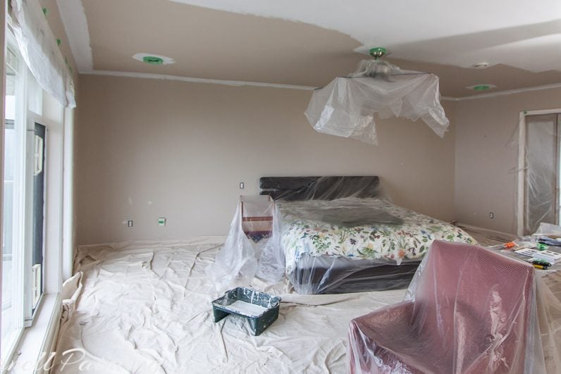
Avoid painting your house yourself unless you’re confident in your skills. A substandard job—drips, roller marks, and uneven cut lines—can devalue your property. Nothing stands out more than a rushed, sloppy paint job done right before listing. Even if buyers make an offer, they’ll factor in the time and cost of repainting. If you want to increase resale value, make sure the painting is done professionally with quality materials and proper preparation.

Repair and Repaint So Buyers See a Well-Maintained Home

Don’t try to hide problems with paint—but once repairs are done, make sure the surfaces look clean and finished. For example, if a ceiling water stain has been fixed, seal and repaint the area so buyers don’t question whether there’s still a leak. Likewise, fix drywall cracks before painting. Buyers notice every detail you don’t address, and small flaws can make them wonder what else has been neglected.

Paint to Appeal to Buyers, Not Personal Taste

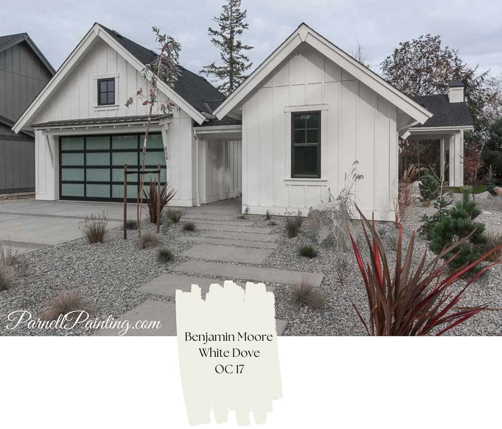
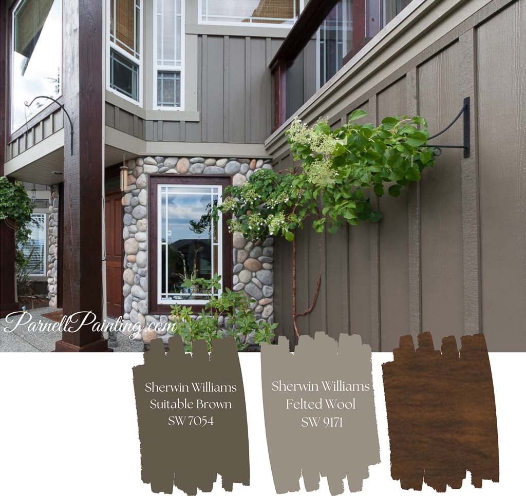
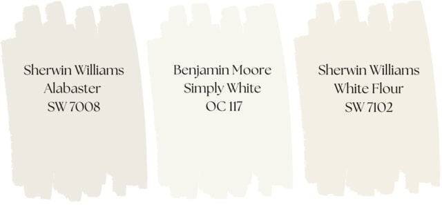
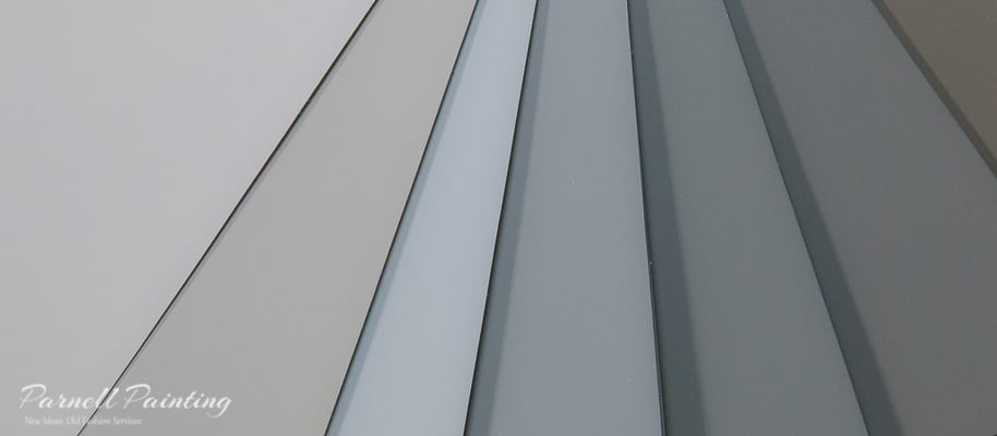
When selling, it’s important to detach emotionally from your colour preferences. You’re painting to attract buyers—not decorating for yourself. Avoid bold or dramatic colours; instead, use light, neutral tones that make spaces feel bright and move-in ready. A soft, modern palette helps buyers envision themselves living there. This also applies to exteriors—choose colours with broad appeal so potential buyers don’t feel repainting is a must-do after purchase.

an interior entry way painted with soft neutral off white paint on the walls and a warm white on the trim work and doors making it ready for sale

Key Areas to Paint Before Selling

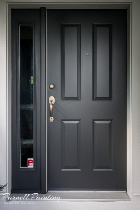
  • Front door and entryway: Create a welcoming first impression.
  • Main living spaces: Refresh living rooms, kitchens, and family rooms
  • Bathrooms: A clean, freshly painted bathroom feels more inviting.
  • Dingy or peeling areas: Repaint anywhere that looks tired or weathered.
  • Bold or outdated colours: Replace them with subtle, neutral shades.
  • Children’s rooms: Tone down bright or themed walls.
  • Ceilings with stains or discolouration: Repair and repaint after fixing the source
a front entry door freshly painted with deep charcoal for a bold statement and to appeal to potential buyers

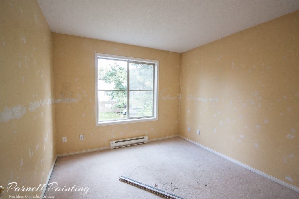
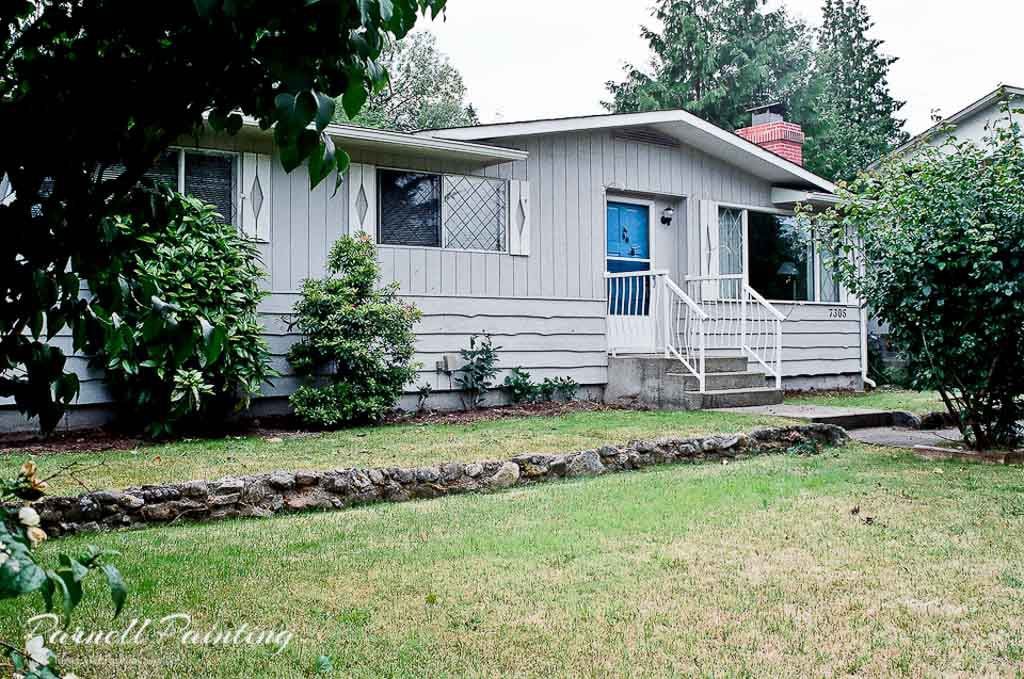
Preparing Older Homes for Sale

Older homes benefit greatly from a fresh coat of paint. Repair imperfections in walls, trim, and doors to restore their charm. Don’t forget ceilings—they often become discoloured over time. Fresh white ceilings instantly make rooms feel brighter.

For exteriors, the right paint colours can modernize an older property. Fill cracks and nail holes in wood siding before painting. Buyers see a recently painted exterior as a major plus—it’s one less project and negotiation point for them.

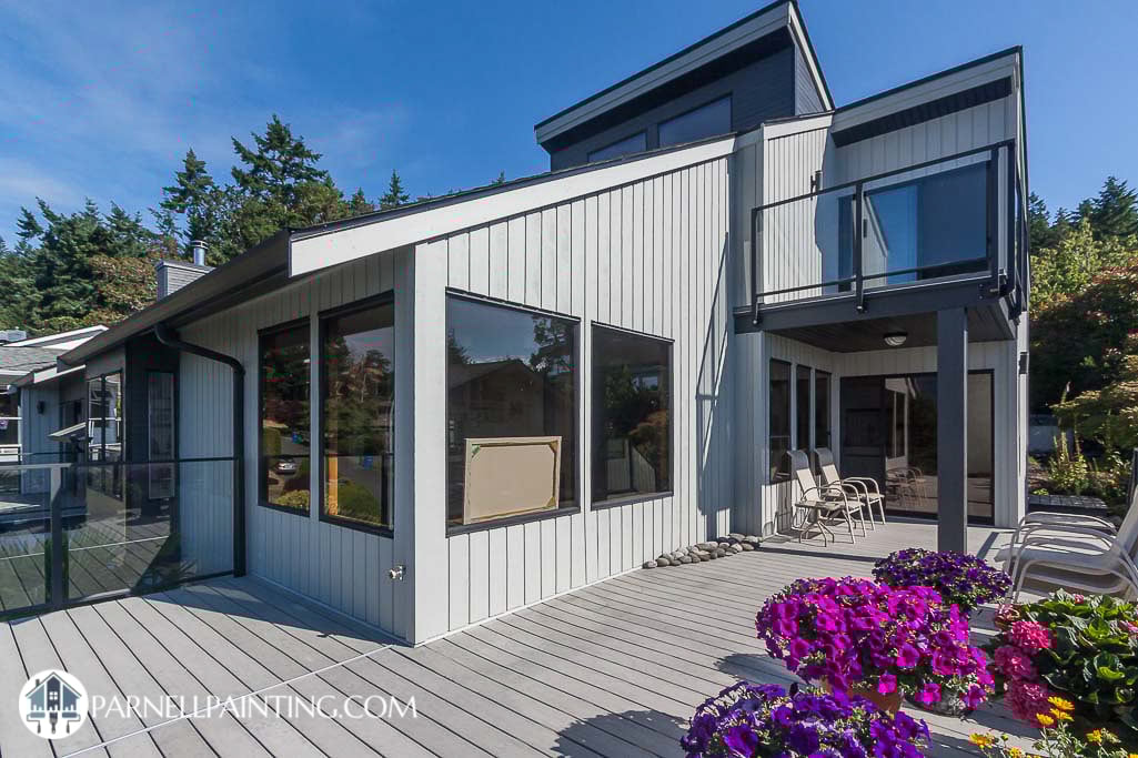
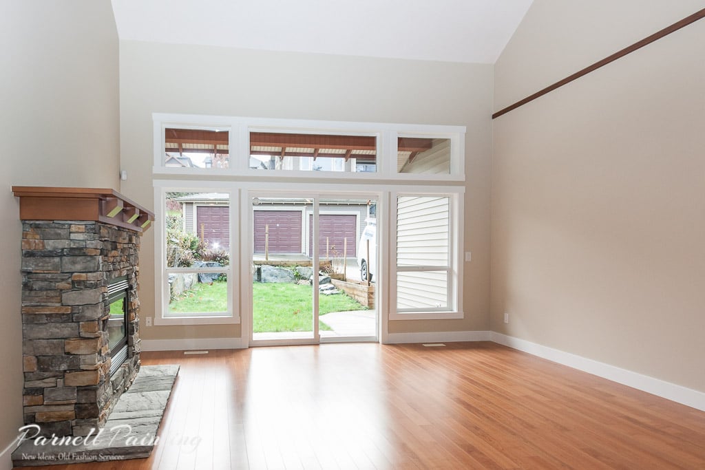
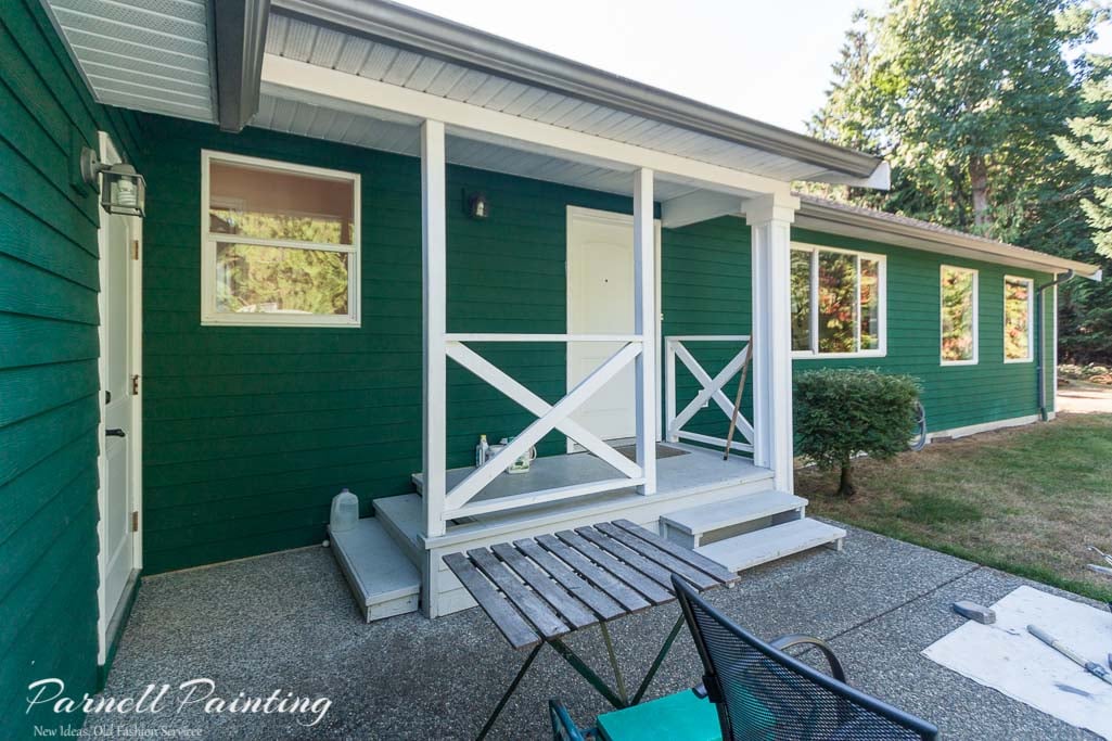
The owner of the house below was considering selling in the near future. Either way the house looks clean, fresh and modern whether it’s to continue to enjoy personally or look it’s best if it’s put up for sale.

an home with tired faded green siding and white trim work waiting to be painted in preparation for sale
a home exterior refreshed to selll with crisp white paint on the trim work and a deep gray on the body

From Faded to Fresh: How Paint Revived This Older Home’s Exterior

This older home was initially considered for new siding, but after thorough preparation and a rich, deeper body colour, painting achieved a dramatic transformation at a fraction of the cost. Holes and cracks were filled and a deeper tone was chosen for the body to help minimize imperfections in the older wood. The outdated window shutters were removed. Landscaping was refreshed with new shrubs and bark mulch, and the dark charcoal front door added stylish contrast. For more simple upgrades that can boost your home’s resale appeal, explore our post on home improvements to make before selling your house.

an older home with tired siding and outdated shutters that is in need of some TLC to prepare it for sale

It’s a modest little house, but it’s now showing it’s best potential.

an older home transformed with new paint colours and fresh landscaping in preparation to sell

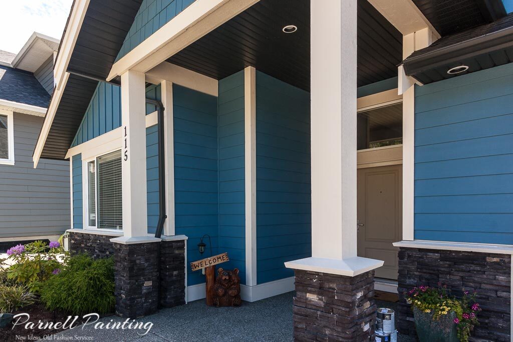
Before and After: A Home Purchased To Remodel And Sell

This property was purchased specifically to remodel and sell. We repainted the full exterior and interior, turning a tired, weathered house into a bright, elegant home that sold quickly.
See a more of the house here: Exterior Transformation For Resale and here: Painting A Home Purchased To Renovate And Flip

a home with older cedar siding that is grayed and weather before it refreshed with new stain
a older cedar siding house after it has been transformed with gray stain and white trim and new landscaping

Parnell Painting Can Help You Maximize Your Home’s Potential

Thinking of selling your home, condo, or rental property? A professional paint refresh is one of the most effective ways to increase resale value and attract buyers.
Contact Parnell Painting today by email or phone for a free, no-obligation quote.

parnell painting new ideas old fashion service

How Room Colours Affect Our Mood

Colour has a powerful impact on how we feel in our homes. The right interior paint colours can make rooms feel larger, cozier, or more vibrant, while influencing mood and energy. When choosing colours, consider not only aesthetics but also the psychological effect each shade can have on daily life.

Ready to explore the best interior paint colours for your home? Learn more about choosing interior colours to find expert tips, inspiration, and guidance for creating the perfect mood in every room.

The Psychology of Colour in Your Home

Colours evoke emotion. Soft tones create calm and relaxation, while bright or bold shades energize a space. The feelings a colour produces can affect your comfort, focus, and overall enjoyment of a room. Before selecting paint, think about the mood you want to create and how your furniture, lighting, and décor will interact with the colour.

Determining the Mood You Want

Explore decorating websites, magazines, or paint company brochures for inspiration. Ask yourself why certain colours appeal to you. For example: Soft, cohesive shades can make a bedroom feel serene and restful. Brighter or vibrant tones can energize kitchens, creative spaces, or home offices.

Example: This bedroom achieves calm and warmth through soft shades and a consistent palette throughout the room.
For more inspiration on creating a calm, inviting atmosphere, see the rest of this home’s beautiful interior here: ranch-style home painted in Aesthetic White.

How Colours Affect Room Perception

Light colours can make rooms feel open, airy, and brighter, while darker colours can add warmth, intimacy, or dramatic flair.

This townhouse living space was painted a light neutral to serve as a blank canvas for a large art collection, creating a bright and open feel. See more of this townhouse transformation here: Changing the wall colour of a new townhouse from brown to white.

Colour Guide

Red Colours

Red energizes and stimulates conversation, but it should be used selectively. In some rooms, it can feel overwhelming, so it is generally best applied as an accent colour. Muted or earthy reds, however, create a cozy and comfortable atmosphere.

Orange Colours

Orange is associated with action and can stimulate energy and creativity. Bright shades of orange are cheerful. This is an ideal colour for creative spaces like studios or hobby rooms and for fitness areas.

Creative home office painted in a cheerful orange shade to inspire energy and productivity.
Music room with soft pink walls creating a refined, elegant space for cello practice.

Pink Colours

Soft pinks calm and reduce stress, while vibrant pinks can be stimulating. Combining pink with grays or blacks creates a sophisticated, elegant look.

Example: This is going to be a music room for cello practice. It uses just the right shade of pink to feel sophisticated and elegant. A brighter or more intense pink could appear garish, but this soft tone creates a refined, welcoming atmosphere.

Yellow Colours

Yellow can emit a feeling of sunshine. It can be uplifting, welcoming and somewhat energizing. Yellows that are too intense like sunflowers can be hard to live with. Muted or softer shades of yellow are best to use if used in an entire room. Yellow tends to be a love it or hate it colour for many people.

Example: The soft yellow walls create a cheerful, bright atmosphere in this family kitchen. This gentle shade is an excellent choice for rooms that receive limited natural light, helping to make the space feel warm and inviting.

Kitchen interior with muted yellow walls demonstrating uplifting colour effects in low-light spaces
Gold-painted accent wall showing how warm colours can enhance mood and style

Gold Colours

Example: This gold colour used as the accent wall creates a completely different feeling than the cheery yellow in the photo above. The rich depth and warmth of gold gives a sense of sophistication, but still looks cozy and welcoming. 


Blue Colours

Blue can be calming or dramatic depending on the shade. Light blues promote relaxation, deeper blues make bold statements. Some blues can also inspire creativity, making them ideal for studies or offices.

Example: This customer choose a blue for their master bedroom. It has quite a bit of depth, but with a warm undertone that creates a relaxed atmosphere.

Bedroom interior using blue paint to balance depth and warmth for a calming effect
Bathroom painted in calming blue tones to create a relaxing, spa-inspired atmosphere

Example: This ensuite bathroom is under construction, but you can see the blue chosen for the walls is going to create a calm feeling like a spa setting.

Example: The bold blue chosen for accent wall in this primary bedroom creates a bold, but sophisticated statement.

Bedroom featuring a bold blue accent wall for a dramatic, sophisticated look.
Interior bedroom painted with soft green to evoke relaxation and connection with nature

Green Colours

Green is closely associated with nature and can evoke a range of moods depending on the shade. Lighter sage and muted earthy greens feel refreshing and calming, making them easy to live with, while darker greens can feel bold and intense. It’s a colour that often inspires strong reactions—people tend to either love it or hate it.

Example: The muted, sage green feature wall in this bedroom mimics the nature outside the windows and creates a sense of calm and tranquility.

Example: The rich, earthy green used in this space that will become an office grounds the room and gives it a sense of purpose.

Interior office with deep green walls demonstrating how colour can ground a space and make it have a sense of purpose
Bedroom interior using light purple to promote relaxation and calm

Purple Colours

Purple adds elegance and creativity to a room, with the effect depending on the shade. Light lilacs create a calm, restful atmosphere, while deeper purples offer a sophisticated, dramatic look. Pairing rich purples with neutrals balances the space, making it ideal for accent walls, creative rooms, or stylish living areas.

Example: The lighter lilac used in this bedroom creates the perfect space to rest with a soft, calming effect.

Example: The vibrant walls of this young girls bedroom create a sense of a space of elegance and whimsy.

Interior room painted with bold purple to create a playful and creative atmosphere

Neutral Colours


Blacks, greys, whites, and browns are considered neutral colours. A room painted in neutral tones can feel calm and cohesive when paired with furnishings and décor in similar shades, or it can be enlivened with bold accent pieces. Black works best when used sparingly as an accent.

Living room painted in warm off-white tones with soft textures decor for a relaxed, cohesive feel.

Example: This living room has warm, off-white walls. There’s minimal contrast in the decor which creates a relaxed feel. Most of the interest comes from different materials and textures.

Example: A complete sense of tranquility and calm has been created in this living room with the walls and almost all of the decor in the the same soft, warm white colour. At the same time it looks very sophisticated. View more of this elegant home here: Repainting a classic interior.

Living room with matching white walls and décor for a calm, sophisticated look.
Neutral off-white walls providing a versatile backdrop for any decorating style.

Example: This living room walls are a light, warm white. The neutral palette leaves the homeowner with the choice to go in many different decorating directions. They could do tone on tone, high contrast or something in between. See the rest of this paint job as an example of how you can use warm white throughout a home: Painting warm white throughout a two storey house.

Gray Colours

Gray colours can create varying moods depending on the shade and depth. Light grays can create calm and airy spaces, while dark grays can feel dramatic and sophisticated. You have to be careful when using gray, it can feel industrial, monotonous or even gloomy in spaces without adequate light.

Example: Darker grays can be used to create contrast between walls and trim or a dramatic feature or accent wall like in this townhome. See how the rest of this home was is transformed here: Modernizing a townhouse with a light neutral walls with a dark charcoal accent.

Living room featuring a dark gray accent wall creating modern contrast.
Dining area with subtle gray accent wall for a calm, cohesive look.

Example: In this dining area, a gray just a few shades deeper than the surrounding walls serves as an accent. The colour scheme maintains a calm, cohesive feel versus the contrast that a darker wall would create. See the rest of this condo taken from dated to modern: A condo update from peach walls to gray

Example: The soft gray walls in this bathroom create a calm, spa-like atmosphere — the perfect space to unwind and relax. See the rest of this house for the new modern look: An update for an open-concept house from gold walls to cool gray

Bathroom painted in soothing gray tones for a spa-like, relaxing feel.
Modern interior with gray walls, warm wood accents, and contemporary fixtures.

Example: The gray walls in this home, paired with the rich wood tones and modern fixtures, create a sense of refined, contemporary elegance. See the rest of the updated rooms in this house painted with Benjamin Moore Silver Satin: Main living area colour changed to Silver Satin

Brown Colours


Brown tones create a comfortable, grounded atmosphere. Lighter shades work well as background neutrals, while deeper browns add warmth, drama, and sophistication. Brown also pairs beautifully with unexpected colours like pink. It’s a good choice for spaces where people gather and relax, such as family rooms.

Example: A deeper brown was used as an accent wall in this kitchen, with a lighter grey on the surrounding walls. It ties in with the tile backsplash and pulls from the browns in the countertop.

Interior kitchen with brown tones demonstrating how neutral shades can create a cozy, inviting space
Bedroom with layered shades of brown on walls and furnishings for a warm, relaxing feel.

Example: A cohesive look is achieved in this bedroom by layering different shades of brown across the walls, furniture, and accent pillows, creating a warm and relaxing space. See the rest of this painting project here: A modern townhouse painted in gray and taupe

Practical Tips for Choosing Room Colours

  • Test sample swatches on walls before committing.
  • Consider lighting: natural and artificial light can change a colour’s appearance.
  • Match colour choice to room function: relaxing bedrooms, energizing kitchens, creative offices.
  • Use accent walls with complementary neutrals to balance bold colours.
  • Take cues from your décor, furniture, and flooring to create harmony throughout the space.
Parnell Painting – professional painters in Nanaimo

Parnell Painting is a trusted Nanaimo residential painting company known for consistent, high-quality workmanship. As a husband-and-wife team with over 20 years of experience, we offer a truly personal painting service. Whether you’re looking to refresh your interior or modernize your home with a new colour scheme, we’ll help you achieve a beautiful result.

Contact us by email or phone to schedule a free, no obligation quote.

Choosing The Best Exterior Paint Colours For Your Home

A west coast style house with cedar siding is painted with a light gray and dark chacoal accents to compliment the black windows.

Why Choosing Exterior House Colours Can Be Overwhelming

Selecting exterior house colours can feel overwhelming – large surfaces, changing sunlight, and surrounding materials like hardscaping, landscaping and neighbouring homes all influence how colours look on your home. With a few key principles, you can confidently choose exterior paint colours that enhance your home’s style and curb appeal.

Pay Attention To The Fixed Elements of Your Home

Before picking paint colours, take note of what can’t be changed — the “fixed” elements such as the roof, brick or stone, railings, gutters, and natural wood. Your colour palette should harmonize with these materials.

  • Roofing: (metal, shingles, terra cotta) Look at undertones — for example, gray roofs may lean blue or green. You don’t need to match them exactly, but your siding should complement the tones.
  • Brick or stone: Notice any flecks of colour? Strong colours like red or orange brick will influence your exterior colour choices.
  • Gutters and downspouts: if they are not being painted their colour needs to be taken into consideration in your overall colour scheme.
  • Windows and trim: Window cladding (white, cream, brown, or black) affects how trim looks. For example, white vinyl windows with dark painted trim create a “picture frame” look, and vice versa — an effect that might not suit every home.

Example of exterior colours that complement the fixed elements of a home. An earthy brown palette was a natural choice, drawing from the tones in the brickwork, while the dark brown trim blends seamlessly with the matching gutters and downspouts. Explore the complete exterior colour update for this house.

Exterior of a house featuring an earthy brown colour palette that complements brickwork, with dark brown trim, gutters, and downspouts blending seamlessly.

Example Of A Cohesive Exterior: The warm gold siding below complements the stone around the garage and contrasts beautifully with the walnut-stained wood in the gables. See the complete re-paint for a Hardie Board house exterior.

Modern house exterior with a coordinated colour palette of warm gold siding, creamy trim, and walnut-stained gables that compliment the brick around the garage overhead door

Coordinate Colours With Hardscaping And Landscaping

Your house colour palette should work with the surrounding landscape, not against it. Use the nature around your home for colour inspiration.

  • Homes surrounded by trees often look best in earthy tones and natural hues.
  • Echo prominent flowers or a red maple tree on your front door for a cohesive feel.
  • Consider how brick driveways, walkways, or stone patios tie into your home’s exterior.

How Natural Light Affects Exterior Colours

Outdoor light makes colours look lighter and cooler than expected. When testing paint chips, look at options two shades darker and slightly warmer than your initial choice.

Example of How Colour Appears Outdoors: The house below is painted with Sherwin-Williams Inky Blue, the same colour as the chip. Notice how natural light makes it appear brighter and cooler compared to the paint chip. See the full colour transformation for this house exterior.

An Exterior house painted in Sherwin Williams Inky Blue showing how much brighter and vibrant it appears compared to the paint chip sample.
a sherwin williams inky blue paint chip sample

Each side of your home will reflect light differently. You may need to prioritize one side when choosing colours— typically the front, for maximum curb appeal.

  • South-facing walls can appear washed out.
  • North-facing areas look darker.
  • Shaded areas under trees or overhangs deepen the colour.

Example: This farmhouse uses Benjamin Moore’s White Dove OC-17. While warm and creamy indoors, it reads as a crisp white outside. View the full exterior painting of this stylish modern farmhouse.

A modern house exterior painted with Benjamin Moore White Dove showing how this colour looks much whiter outdoors versus the warm, yellow undertone it has indoors.

Selecting the Right Paint Sheen for Exteriors

All things being equal, higher-sheen paints resist dirt better and are easier to clean. If your landscaping contributes to dirt splashing back or getting blown onto your house a higher sheen might be the best option. The drawback is higher sheens highlight imperfections and texture.

Choosing paint sheens comes down to a balance of aesthetics and ease of cleaning and durability. For most exteriors:

  • Flat or low-lustre finishes work best on textured surfaces like wood, stucco, or Hardie Board.
  • Satin finishes are often used for trim and doors, offering a subtle shine and more durability.

Sheen affects colour appearance – the same colour tinted in various sheens of paint will look different. Colours in higher sheen paint tend to look more intense.

Hardie Board siding products can have a lot of texture and will look very different depending on the sheen of paint used. See the noticeable difference between satin sheen paint on the left that highlights the texture, while the flat paint on the right doesn’t due to the lack of reflection.

a james harding board house with a satin paint that highlights the texture of the horizontal siding
a house exterior with james hardie siding painted with flat paint that does not highlight the texture in the horizontal siding

Common Mistakes To Avoid When Choosing Colours

Avoid these pitfalls to keep your house looking cohesive and timeless:

  • Watch your undertones. Warm and cool tones can clash if not planned carefully.
  • Don’t highlight unattractive features. Paint vents or utility boxes the same as the siding. Save the contrasting or accent colours for attractive architectural details.
  • Stay neighbourhood-friendly. You don’t have to be a wallflower, but if you want to stand out, do it tastefully — don’t clash with nearby homes. Don’t pick colours that are too vibrant or bright unless they suit the particular style of your house.
  • Limit your palette. Two or three colours are usually ideal, including trim and accents. Keep in mind that your roof, brick, stone work and other fixed elements are all colours on your house and contribute to the overall scheme. Too many colours on your house will make it look overly busy.
  • Consider fading from sunlight exposure. Bright primary colours or dark colours can fade faster in direct sunlight. Subtrastes prone to warping like wood doors are at more risk if painted in dark colours.
  • Understand how colours appear outdoors. Sunlight can make paint look lighter, cooler, or different than expected

Use Colour to Enhance Or Soften Architectural Details

Look at the architectural features on your house and decide what to highlight and what to blend in.

  • Paint attractive decorative trim or gables in a complimentary colour to the house body or a contrasting or slightly darker or lighter shade.
  • For busy façades, paint some elements the same colour as the siding to create calm and cohesion.

Below is a excellent example of a house that can benefit from a calmer colour scheme. It’s very busy with numerous, colours, shapes, lines and textures.

a before photo of a house with a lot of architectural details and too many paint colours that make it too busy looking
Before photo of a house exterior that looks very busy with many colours and architectural details.

The new colour scheme ties in with the the dark stained entry pillars and upper deck railings. To calm some of the busy architectural details the vertical corner trims have been painted that same as the body colour, as well as the window trim above the upper deck patio doors. A remarkable difference! See the rest of this remarkable exterior makeover.

an after photo of a house exterior that was painted with a new colour scheme to calm down busy architectural details
After photo of a house exterior painted in a cohesive colour scheme that suits the architectural details of the house.
a house exterior with Sherwin Williams suitable brown on the body and felted wool on the trim work


The house below had the opposite issue — it looked plain and lacked visual interest, with many of its architectural details blending in.
A new exterior colour scheme completely revitalized this home. The slightly deeper gray-green body adds character, while the livelier gable colour and charcoal entry doors create contrast. Painting the trim in a much lighter version of the body colour brought out the architectural details and gave the house fresh curb appeal. See how the new colour scheme looks on the rest of this Hardie Board house.

before photo of a bland house exterior that needs to have more contrasting paint colours
an after photo of a house exterior painted in a colour scheme of grays and greens with lighter trim that highlights the architectural details
A house exterior body painted with Sherwin Williams Hardware and three coordinating colours for the trim, gables and front entry door

Why Muted Colours Work Well Outdoors

Bright, saturated colours that look appealing on paint chips can appear harsh or unnatural on large outdoor surfaces. Muted tones — colours with gray or earthy undertones — blend better with natural surroundings and age more gracefully. For example: if you like blue or green, choose a shade that has a slightly grayed-off tone versus a brighter version of the same colour.

Pay Attention to Undertones In Exterior Colours

Understanding undertones is key to choosing harmonious colours. Compare several options side by side — differences become more obvious that way.

To be able to pick colours that work well together and with the other elements on your home you need to get familiar with undertones. Once you understand how to identify the undertones in paint colours you’ll have more confidence in picking colours that coordinate with your home and its setting. The best way to see the undertones in a colour is by comparing it with other colours.

Example: Benjamin Moore’s Blue Heron has a violet undertone may not be that noticeable when viewed on its own, but becomes more noticeable when placed next to Van Deusen Blue — and can appear even stronger under exterior lighting.

Benjamin Moore Van Deusen blue versus Blue Heron

Fade-Resistant Exterior Paint Colours

Modern paints include UV protectants, but bright and dark colours still fade faster than light, earthy tones. For longevity, opt for earthy, natural colours or toned-down versions of your favourites.

  • Deep blues, greens, and reds may lose vibrancy over time.
  • Muted neutrals and off-whites tend to last longest.

The photos below show how harsh sunlight affects vibrant paint colours. While the entire house has experienced some fading, the south-facing side — exposed to the most intense sun — has faded significantly more. See the dramatic before-and-after of this house re-painted in gray and white.

A Safe Approach: Use Shades from the Same Colour Family

A monochromatic palette is a timeless, low-risk option. It creates subtle contrast and visual depth without feeling busy.

  • Mid-tone shade for siding
  • Lighter shade for trim
  • Darkest shade for the front door

Paint manufacturers typically have sample strips featuring a range of colours within the same family. The example below from Sherwin-Williams shows a monochromatic exterior colour palette that can be used in several ways. For instance, Intellectual Gray or Worldly Gray works well for the body, Alabaster for the trim, and the darker Porpoise for the front entry door and accent details.

a set of monochromatic colours that can be used to create a cohesive colour palette for your house exterior

Choosing the Right Garage Door Colour

Garage doors can be tricky — should they be the same as the body colour, the trim colour, or something different altogether? It depends on the colours being used, the style of the house and the location, size and number of overhead garage doors.

A guide to options:

  • Match the trim colour for a balanced, unified look.
  • Blending them in with the body colour works for some houses but it can take on the look of a monolithic structure for others.
  • Most often you don’t want to draw attention to garage doors by painting them with an accent colour.
  • Slightly lighter or darker tones than the main siding can add definition without harsh contrast.
  • Consider using a shade or two lighter or darker than the house body to add definition without harsh contrast.

Where to Find Exterior Colour Inspiration

There’s no shortage of colour inspiration:

  • Neighbourhood drives: Note colours you find attractive on homes similar in style to yours.
  • Paint manufacturer tools:
    • Benjamin Moore Personal Colour Viewer lets you upload photos of your home or use the provided ones to play around with colour. Sherwin-Williams Colour Tools offers similar software and downloadable brochures. Most paint manufacturers have both online and in-store brochures for inspiration and pre-selected exterior colour palettes to look at.
  • Online platforms:
    • Houzz — Search specific home styles and save ideas to a personal ideabook.
    • Pinterest — Organize boards by home type, palette, or style (e.g., “Modern Exterior Colour Combinations”).
    • Youtube – explore decorating tips and colour reviews.
    • Decorator’s blogs – a wealth of colour information
A colour palette sample featuring a black, white and green colour for a house exterior

Test Paint Colours Before You Committ

It’s nearly impossible to envision an overall colour on your house from a tiny paint chip.

Once you’ve narrowed your choices:

  1. Buy sample sizes – you can start by painting the colours onto poster boards so that you can move them around, but make sure you eventually test directly on your house and siding.
  2. View samples at different times of day — morning, afternoon, and evening light all affect colour.
  3. Compare colours beside fixed elements like brick or stone for the most accurate read.
Parnell Painting – trusted professional interior and exterior painters in Nanaimo

Bring Your Vision to Life with Parnell Painting

Ready to update your home’s exterior? We are a husband and wife team that have been providing high-quality interior and exterior house painting in Nanaimo for over 20 years. We can offer colour advice to give your home a fresh new look. Contact us by phone or email to schedule your free, no-obligation quote.

Changing From Cooler Gray To A Warm Neutral

We were pleased to paint for these clients again after doing their full exterior the previous year. They were ready to make a change from the cooler gray tones that the interior walls were originally painted.

To add warmth to the look of the home they chose a modern beige to use throughout the main living area, hallways and bathrooms. To compliment the warmth of the wall colour the trim work and doors were done in a Benjamin Moore’s simply white.

Below are the before and after images of the living room change from cool gray to warm beige.

Below are the trim work and doors re-painted in the Simply White, that has a slight yellow undertone. It compliments the warmth of the wall colours. A true white would have looked too stark against them.

The primary bedroom going from cool gray with a violet undertone to a warm coral colour has completely changed the feel of the room.

This young child’s bedroom was re-painted in a green with just enough punch to make an impact, but not so vibrant that it becomes overwhelming.

Choosing Interior Paint Colours

Choose Colours That Feel Right For You

There are people who choose colours with ease for their vehicles, accessories and clothing, but for some reason they have a great deal of anxiety when it comes to picking paint colours for their home.

Start by selecting colours you feel comfortable living with. Draw inspiration from nature, your favourite clothing, or decor you already own. If you’re hesitant about bold wall colours, add pops of colour through accessories—such as throw pillows or artwork—instead of repainting entire walls later.

Feeling Lost? Start by Eliminating What You Don’t Like

If you’re unsure where to begin, narrow your choices by ruling out colours you dislike. For example, if you don’t like yellows or greens, focus on blue, gray, or brown tones. This simple process helps you see which shades you will be most comfortable with in your home.

Current Paint Colour Trends

Major paint companies like Benjamin Moore and Sherwin Williams regularly share trend forecasts online and in stores. You can also find many decorating and home improvement websites that focus on colours. Use them for inspiration, but don’t get too caught up in short-lived fads. While gray walls dominated for years, some trends fade fast—choose colours you’ll love long-term.

Tips for choosing trendy colours wisely:

  • Use trend palettes as starting inspiration — but always ask: will this colour look good for you in 5 years?
  • Pair a trending hue with timeless neutrals or wood/stone elements to anchor the look.
  • Test how the colour appears in your room’s lighting and context, not just from the palette photo.
  • Decide whether you’re using the trend for an accent or entire wall — accent usage is less risky.
  • Incorporate trend colours via decorative items if you’re hesitant to commit to wall-paint.

Use Paint Manufacturer Colour Tools

Benjamin Moore’s Colour Portfolio app lets you take a photo of any object and match it to their closest paint colour. You can also upload photos of your rooms to visualize new wall, trim, and ceiling colours.

Sherwin Williams’ ColourSnap Visualizer works similarly—you can test colours on your photos or explore their preloaded examples. Their website also offers helpful resources on colour theory and how to choose paint colours that work together.

Online Resources for Colour Inspiration

Houzz and Pinterest are excellent for collecting decorating and paint ideas.

  • On Houzz, create an Idea Book to save your favourite colour schemes or projects.
  • On Pinterest, search for specific ideas like “calm wall colours” or “popular blue bedroom colours,” then pin them to organized boards for future reference.

You can also browse interior design blogs or YouTube reviews for insights on popular colours (e.g., “Benjamin Moore Simply White review”).

Living room painted in soft neutral tones showing comfortable, timeless interior colour choice.

Creating a Mood With Paint Colour

Paint colour has a powerful impact on mood and emotion—it sets the tone for how a room feels and functions.

Ask yourself what kind of atmosphere you want to create:

  • Relaxation and tranquility in a bedroom
  • Playfulness and fun in a child’s room
  • Calm, spa-like tones in a bathroom
  • Energy and creativity in a workspace or home gym

Do you want the space to feel light and airy, or warm and intimate?

For more insight and examples, see our post: How Room Colours Affect Mood

There’s Nothing Wrong With Choosing Neutral Colours

Neutrals aren’t boring—they’re timeless, versatile, and provide a perfect backdrop for furniture, artwork, and decorative accents to shine. Using neutral wall colours allows you to change your décor and accessories without repainting, making them a practical long-term choice.

Warm greige or beige walls create a cozy, comfortable atmosphere, while creamy whites bring a fresh feel to help rooms feel larger and more open.

For added interest, consider a monochromatic palette, using several shades of the same colour throughout a room or home for subtle depth and sophistication. Alternatively, many paint brands offer pre-selected complementary colour schemes, making it easier to coordinate walls, trim, ceilings, and accent features while ensuring your space feels harmonious and well-balanced.

Modern greige and beige colours can give your interior warm and comfortable feeling.
Creamy whites can act as a great neutral back drop to decorate against.

Choosing Paint Colours for Renovations or Redecorating

When renovating or buying new furniture, choose paint last. Start with fixed elements like flooring, countertops, and cabinets, then your main furnishings. Once those are set, select paint colours that tie everything together. Paint offers endless colour options—you can always find a shade that complements your space.

Updating a Single Room Colour

Before repainting an existing room with a colour you’ve fallen in love with, consider how the new colour works with fixed elements like floors, cabinets, countertops, and furniture. Ensure it complements other elements if they are not being replaced like curtains, blinds, area rugs and artwork. These can all provide inspiration for your colour choice. Pay attention to the colour of nearby rooms to create a cohesive flow throughout your home.

How Lighting Affects Paint Colour

Lighting—both natural and artificial—can dramatically change how a colour looks.

  • Natural light direction (north, south, east, west) influences whether a colour appears warm or cool.
  • Artificial light bulbs cast yellow, blue, or green hues.
    Test paint samples at different times of day to see how they shift.

The same colour can appear completely different from one wall to another. You may need to accept a compromise—colours often look best at certain times of day or under specific lighting. You can try changing out your light bulbs to a different colour temperature to see if it helps.

The next two photos show how the same paint colour can look completely different depending on lighting and surroundings. All of the walls in these photos are painted with Sherwin Williams Repose Gray.

In the first photo, the natural light makes the window wall appear darker, bringing out a subtle violet undertone. The fireplace wall appears lighter with a hint of green, likely influenced by the tint of the window glass and reflected outdoor colours.

photo showing the green and violet undertones of sherwin williams repose gray colour on interior walls

In the second photo, the dining hutch wall appears to have a slight green undertone, while the wall below the loft takes on a hint of violet. The loft wall near the railing looks noticeably cooler and more blue, showing just how much lighting and surroundings can shift the appearance of a single paint colour.

photo showing how sherwin williams repose gray paint colour can show different undertones

Using Accent Colours

Random accent walls can look unplanned. Use accent colours intentionally—on recessed walls, end walls, or to highlight artwork or architecture.

The photos below show how colour blocking with deep gray accent walls add contrast and depth to white rooms throughout this townhouse.

Modern townhouse living room with dark gray colour blocking to accent and add interest to the white walls

Choosing a Paint Colour for Ceilings

When repainting walls, check if your ceilings need a refresh. This is the time to get it done. Ceilings can yellow or discolor over time, especially with textured finishes. Fresh ceiling paint brightens a room. A new coat can instantly refresh and clean up the look of your interior, giving it a crisp, finished appearance.

For the best results when painting ceilings, consider these professional ceiling painting tips:

  • Don’t assume your ceilings are white. Over time, they can gradually discolour, and you might not notice until you repaint your walls. Hold a sample of your new wall colour next to the ceiling—you may be surprised to see how dull or off-white they are.
  • Consider the effect you want. A white ceiling gives a sense of height and openness, while a tinted or darker tone can create warmth and coziness — perfect for spaces like a den or family room.
  • Use the right sheen. A flat sheen paint finish helps hide surface imperfections better than glossy finishes.

This primary bedroom before and after: The ceiling painted white, walls in light cream, and a sage green feature wall. The white ceiling brightens and refreshes the space.

Beige primary bedroom ceiling in the process of being painted white showing how much brighter it will make the room.
Primary bedroom after painting transformation showing how much brighter the room looks with a white ceiling.

In this open-concept living space, a rich green-gray was used on both the walls and the tray ceiling above the dining table. Choosing a darker accent ceiling colour instead of white helps define the dining area and enhances the architectural design. The depth of the colour adds warmth and sophistication to this interior painting project.

Interior of open-concept home showing walls and tray ceiling painted in the same green-gray to define and cozy the dining area

Creating Flow Throughout Your Home

Using the same paint colour—or subtle variations of it—throughout your home creates visual flow and harmony, which is especially important in open-concept floor plans. Start by selecting the main colours for your primary spaces, such as living rooms, kitchens, and hallways, and then build your secondary palette around them. This ensures a cohesive feel from room to room.

You can still add personality and interest by incorporating accent walls, feature rooms, or contrasting trim. Small touches like coordinating rugs, textiles, and décor reinforce the colour story and make transitions between spaces feel seamless.

Choosing Paint Chips and Applying Colour Samples

a fan of paint chip samples in tones of gray and blue

Paint chips are just the starting point for selecting your interior paint colour. Take several shades home, including lighter and darker variations, and view them under different lighting conditions to narrow down your choices.

When testing paint colours:

  • Hold the colour chips next to trim if it’s not being repainted, to ensure the colours coordinate well.
  • Compare the chips with your furniture and fixed elements like flooring, cabinets, and countertops.

Once you’ve narrowed your choices to one or two colours you can purchase sample-size paint from most paint manufacturers.

  • Use poster boards to paint large swatches and move them around the room.
  • Leave a white border around the poster board. This creates a neutral break between your existing wall colour and the new swatch, giving a truer sense of how it will look.
  • View the samples at different times of day and under artificial lighting to see how the colour changes.

If you want even more confidence before committing, apply a small test area on the actual walls and trim (if being painted). Ensure the paint is opaque enough to evaluate, but avoid thick layers or ridges to reduce the need for sanding before the full application.

Paint Sheen Affects Colour Appearance

The paint sheen you choose can alter how a colour looks:

  • Flat/matte: truest representation of a colour due to lack of reflection
  • Eggshell/satin: moderate reflection
  • Semi-gloss/high gloss: more reflection, appears more intense

Paint samples are often in eggshell or satin, so the final colour might look slightly different depending on your chosen finish.

To fully understand paint sheens see our detailed post on how sheen can have an effect on a colour.

Parnell Painting – professional painters in Nanaimo

Parnell Painting is a trusted Nanaimo residential painting company known for consistent, high-quality workmanship. As a husband-and-wife team with over 20 years of experience, we offer a truly personal painting service. Whether you’re looking to refresh a single room or modernize your home interior with a new colour scheme, we’ll help you achieve a beautiful result.

Contact us by email or phone to schedule a free, no obligation quote.

What Should A Professional Interior Paint Job Look Like?

The reality is that many homeowners don’t know what to expect from a professional painting contractor. Without knowing the difference between a mediocre and high-quality paint job, it’s easy to accept poor workmanship as the norm. Once you’ve seen a truly professional finish, any subpar work stands out immediately.

A great paint job is about much more than colour. The foundation of a flawless finish lies in proper surface preparation. Even the best paint can’t hide poor prep work.

Signs Of A Poorly Done Paint Job

One of the most noticeable indicators of inexperience is sloppy cut-in lines. Where walls meet ceilings, baseboards, doors, and window trim, the paint should have crisp, straight edges. A wobbly or uneven line is a clear sign of unskilled work.

The paint itself should be even, smooth, and consistent—no streaks, drips, ridges, roller marks or debris in the finish.

The photo on the lower left is an example of a poorly done cut-in against the window casings. There are spots of wall paint on the trim and the line defining the trim and wall is not straight. On the right is a precise cut-in of the wall paint against the trim work.

The photos below depict a poorly done cut-ins against the window trim that wiggly and sparse showing some of the previous wall colour. Versus a precise cut-in with clean trim work.

a interior wall and trim work around the window with wall paint poorly cut in around the window trim
an interior wall and trim work in a house that has been professionally and precisely painted

The photos below show an uneven cut-in above the baseboard versus a straight and precise cut-in.

a wall poorly cut-in along the top of a white baseboard
crisp clean cut-in line between the wall and the baseboard done by professional painters at Parnell Painting in Nanaimo

Below is a cut in that’s wavering along the interface of the wall and crown molding versus one that is precise and straight.

a dark brown wall with white crown molding that has some wiggly paint lines on the bottom of the crown molding
an interior house wall and crown molding that has been painted with precision

Paint Should Stay Where It Belongs!

Wall paint shouldn’t be poorly cut where it’s wiggly and extending past the walls into the trim work and ceilings.

Professional painters carefully mask and protect surrounding surfaces with drop sheets and plastic, and they remove items like switch and outlet covers and mask and tape or remove other fixtures to ensure a clean finish.

Below you can see a wiggly line where the wall and ceiling meet versus a clean cut-in with no paint extending up into the white ceiling.

a poorly painted wall with wiggly lines and paint going up into the ceiling
a house wall painted with a straight crisp line where it meets up with the ceiling

It goes without saying that paint should not be on cabinets, flooring, hardware, fixtures, and furniture or personal belongings. This is beyond unskilled painting, it’s just plain carelessness. Below is a well protected painting space.

A living space with drop sheets and walls prepared for painting by professional Painters at Parnell Painting in Nanaimo

Full Paint Coverage Requires More Than One Coat Of Paint

A professional paint job provides full, even coverage with no thin spots or shadowing of the previous colour. It doesn’t matter how expensive the paint is, the best results almost always come from a minimum of two coats of paint.

The Importance Of Sanding

Sanding is a vital part of what makes a quality paint job. Each time a surface is painted without being sanded or sanded properly it adds to the demise of the surface aesthetics. Depending on the circumstances it can also lead to paint failure.

Proper Patching

Walls should be inspected and repaired before painting. Small dents, nail holes, and scratches are filled, sanded smooth, and blended into the surface.

poorly patched interior house wall with irregularly sanded patches

Poorly done patching can cause more issues than not patching at all. An unskilled person tends to over-apply the patching compound. If these areas are not sanded out properly it leaves behind raised, uneven areas on the wall. It’s not uncommon to come across walls that have unsightly patches like this that keep getting repainted over and over without anyone addressing them. When someone finally decides to fix the walls it can take a lot of work to get them smooth again.

The effort it takes to do extensive wall prep as depicted in the room below is well worth it when you see the final results.

a yellow bedroom with an extensive amount of wall patching and repair
a bedroom in a house that has been freshly professionally painted in a light cream colour by Parnell Painting in Nanaimo

There’s An Art To Caulking

Caulking is an important part of the painting process and there’s a skill to applying it. It seals gaps between trim, baseboards and walls to create a seamless, professional look. For most applications caulking should be done before the painting. If it’s not painted over it can discolour and become a magnet for dirt and dust and become dingy looking.

Removing Hardware Before Painting

Professional painters remove switch plates, outlet covers, door hardware and anything other fixtures on surfaces when possible. Anything left in place is carefully masked and painted around cleanly—without highly visible brush marks or uneven edges.

Quality Paint And Materials Make A Difference

A professional painter will use high-quality paint and ensure that the correct product is being used or if special sealers or primer are required. The quality of the brushes, rollers, patching materials and caulking also play a big role in the final results.

Furthermore, it’s important to note that a painter has a range of price and quality levels to choose from within each paint manufacturer’s line. Even the most well- known paint companies have paint that is lower grade. A reputable and professional painter uses high-quality paints, primers, and tools suitable for each surface.

Examples Of Professional Painting Work

Parnell Painting is a small Nanaimo painting company that takes the time to do the correct preparation and leaves behind work that we can be proud of every time. We are a husband-and-wife team that has over twenty years of experience delivering high-quality interior and exterior painting in Nanaimo.

See more examples of our painting here: Exterior painting work and interior painting work.

company logo of Parnell Painting company a professional top painting company in Nanaimo

Contact us at Parnell Painting by email or phone for a free, no obligation quote for your interior or exterior residential painting project.

Hire A Professional Painter Or Do It Yourself?

Before deciding whether to hire a painter or tackle a project yourself, consider a few key questions: What quality of work can you achieve? How much time will it take? Do you have the necessary equipment, and if not, what will it cost to acquire it? For insight into professional standards, explore our Interior Painting Services and Exterior Painting Services.

Essential Equipment And Materials

A Basic Painting Job Reqiures:

  • drop sheets and protective plastic
  • roller cages and poles, roller sleeves, trays and liners
  • brushes, brush buckets and liners
  • painters tape
  • dust masks or respirators
  • sandpaper and sanding poles
  • caulking and filler and application tools
  • primer or a special sealant as needed
  • paint and the time to do the research for the right products
  • ladders, including specialty ladders for stairwells or tight access
Interior room in a nanaimo house prepped for painting by Parnell Painting. Drops sheets on the floor, painting equipment set up and walls patched

Professional painters arrive fully equipped with everything they need. They purchase paint and materials at contractor rates, often far cheaper than retail. Factor in time, effort, and cost when deciding whether to DIY.

Painting Knowledge And Experience

A professional contractor knows how to properly prep surfaces for a durable, long-lasting finish. They can identify hidden issues that a homeowner may overlook and apply the correct techniques, paint types, and finishes for your project.

Quality Of The Work

Can you achieve the high quality of a professional painter? Experience is crucial to ensure clean cut-ins and even roller coverage for visually appealing surfaces. Inexperience often leads to wobbly lines, uneven finishes and paint overlapping into trim or ceilings. Professionals bring tricks of the trade and skillful methods to reach tight or difficult areas.

Prossional interior painting by Parnell Painting in Nanaimo showing crisp clean cut in lines of a baseboard and wall

Clean Up

Hiring a professional means you don’t have to worry about cleaning up. Floors and surfaces should be left free of dust and debris. Garbage and empty paint cans are removed, recycled, and disposed of. Work is completed with minimal disruption to your household.

Time And Efficiency

What can seem like an insurmountable task to a homeowner can be completed quickly and efficiently by a professional painter. Even if you can achieve a decent result, do you want a task that should take days to stretch into weeks – eating up your weekends or time off. Hiring pros lets you focus on what you enjoy while they handle the painting.

Safety

Many painting projects require tall ladders or specialty equipment. It’s not worth risking your safety if you’re not confident and comfortable using ladders. Leave this work to an experienced painting contractor who is trained and experienced in these conditions, minimizing risk and ensuring safety.

Parnell Painting, a professional local Nanaimo interior and exterior residential painting company.

Save yourself time, stress, and potential mistakes by hiring professionals who do this work daily. Parnell Painting is a husband-and-wife team that has over 20 years of experience and would be happy to provide a free, no-obligation quote. Contact us by email or phone to get started.

What To Consider When Hiring A Residential Nanaimo Painter

Get Multiple Painting Quotes

Before hiring a painter, it’s smart to gather several quotes—just as you would for any home project. Take time to compare not just prices, but what each estimate includes. Read carefully, ask questions, and make sure you’re comparing equal levels of preparation, materials, and coatings.

Take the time to find out who you are letting into your home and around your family, pets and belongings. Get references, a reputable painting contractor should provide contact details for past clients who confirm their quality of work, professionalism and reliability.

Learn more with this guide: Why Painting Quotes Vary.

Why Hiring a Residential Painter Can Be Tricky

Finding a trusted painter can be difficult compared to other tradespeople. While every profession has its range of skill and ethics, the spectrum among painters is especially broad, making careful research and selecting a reputable contractor essential. Skill levels and professionalism vary widely, from meticulous and professional to inexperienced and sloppy.

Many companies rely on temporary or seasonal workers, which can affect quality and consistency. Take time to research, verify credentials, and hire a company with a proven reputation for dependable, detailed work.

It may not be the best idea to hire this painting crew!

Professional Nanaimo painting company Parnell Painting shows an example of who not to hire to paint your home with a photo of a painter holder a ladder out the window of a driving car.

Where to Start When Looking for a Painter in Nanaimo

Ask for referrals from people you trust and more importantly who have quality expectations that match yours—if family or friends don’t know of anyone ask a local trades person, realtor, home inspector, or paint stores for recommendations.

Once you have a few leads, invite the painters to visit your home or job site. A professional will take time to review the space, answer your questions, and discuss your goals before preparing a detailed estimate.

Key Considerations When Choosing a Painting Company

  • Who will actually do the painting, and what experience do they have?
  • Does the company have long-term, skilled employees?
  • Are seasonal students or sub-contracted painters hired just to book volumes of work when the labour demand is high in the exterior season?
  • Will the owner or a supervisor be on-site during the job?
  • Will your project be worked on continuously until it’s done or will there be delays as the painters bounce from job to job.

Scheduling Your Painting Project

Confirm the project start and completion dates. Inquire whether the crew will show up when planned and work steadily or split time between other jobs. Reliable painters will communicate clearly, stay on schedule, and minimize disruption to your home.

Questions to Ask Your Residential Painter

  • Are you licensed and do you carry WorksafeBC and liability insurance?
  • Can you provide references and examples of previous work?
  • What steps are taken to protect my home, furniture and flooring?
  • What is the payment schedule?
  • Is the quote cost fixed or subject to change?
  • What surface preparation is included?
  • What type of brand and quality of paint will be used and how many coats?
  • What is the time schedule for starting and finishing?
  • Who will perform the work and what is their experience?
  • As the homeowner, do you need to prepare anything before the job begins? See our guide for more info: How To Get Your House Interior Ready For Painters

Traits Of A Professional House Painter

A professional residential painter takes pride in their craft and treats your home with care. Look for someone who is:

  • Punctual, courteous and organized
  • A clear communicator and willing to answer questions
  • Manages expectations by being honest about what can and can’t be done
  • Focused on customer satisfaction with the work and overall experience
  • Consistently striving for excellence on every job
  • Up-to-date with paint technology, products and trends

Red Flags to Watch Out For

  • Unprofessional or discourteous behavior, not easy to talk to
  • Verbal quotes, or quotes with little detail
  • Large upfront payments or asking you to supply paint and materials
  • Estimates that seem extremely high or low
  • Companies that book large volumes of exterior work and may run out of time to get your job completed.
  • Fly-by-night painters that don’t care about end results and may disappear after the job
top nanaimo painting company parnell painting logo

Save time, stress and uncertainty – hire experienced professionals who care about your home.

Contact Parnell Painting by email or phone to schedule a free, no obligation quote. You’ll meet the husband and wife team who’ve been painting Nanaimo homes for over 20 years. Our clients know they can relax because their painting project will be done right, on time and with lasting results.

Why Do Painting Quotes Vary So Much?

Painting quotes can vary widely, making it challenging for homeowners to decide. A higher price doesn’t always guarantee better quality, but an unusually low price usually means something is being compromised. Price alone should never be the determining factor when choosing a painting contractor.

One of the main reasons for price differences is preparation work. Proper prep can take longer than painting itself and is essential for a durable, professional-looking finish that will have lasting results. Painters offering extremely low quotes often rush the job, prioritizing speed over quality so that they can move on to the next job.

Other factors affecting quotes include the quality of paint and materials, the number of coats, and the experience of the laborers. A low-priced job may be rushed to maximize profit, sometimes using less skilled or temporary workers.

extensive professional preparation work and patching to an interior stairwell done by Parnell Painting in Nanaimo
the high-quality and flawless finish results of a interior stairwell painting job done by Parnell Painting in Nanaimo

Factors To Consider When Comparing Quotes

  • Licensing and insurance: Is the company licensed, and do they carry WorkSafeBC and liability insurance?
  • Who’s doing the work: long term employees that are skilled and experienced painters are going to cost more than temporary summer students
  • Quote type: Is it a fixed price, or could extras be added later?

The quote you receive doesn’t have much merit if it is lacking detail. A painting quote should outline:

  • Preparation, cleaning methods, sanding and caulking
  • Additional specialized work if required
  • Protection and cleanup
  • Type of paint and number of coats
  • Rooms or exterior areas to be painted
  • Specify surfaces, walls, trim, doors and ceilings
  • Areas or work that are not included
  • Mentions of liability insurance and WorkSafeBC coverage
  • Pricing details and payment schedule
Parnell Painting in Nanaimo is a professional interior and exterior residential painting company with over 20 years of experience

Parnell Painting is a locally run, small Nanaimo company. We’re a husband and wife team that has been delivering high-quality professional painting in Nanaimo for over 20 years.

Our clients are never left wondering what they will be getting. Contact us by email or phone to schedule a free, no obligation detailed quote.

Bedrooms Painted In Warm White

The owner of this home wanted these previously beige bedrooms changed to white. Everything was re-painted with a warm white including the ceilings, walls and the previously painted trim work. The new look is fresh and bright.

  • « Go to Previous Page
  • Page 1
  • Interim pages omitted …
  • Page 4
  • Page 5
  • Page 6
  • Page 7
  • Page 8
  • Interim pages omitted …
  • Page 15
  • Go to Next Page »

Footer

About Us
Our Estimates
The Services We Offer
Interior Painting Services
Exterior Painting Services

Client Testimonials
Inteior Painting Portfolio
Exterior Painting Portfolio

contact@parnellpainting.com
(250) 585-7222

Check Out Our Socials

Instagram


Facebook

Copyright © 2026